10 steps to clean up a PowerPoint/Excel data chart
Jan Schultink
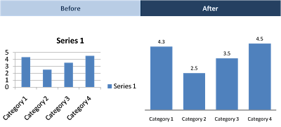
When you hit "insert chart" in Excel or PowerPoint, a pretty ugly graph shows up. Here are the steps I take to clean things up:
Horizontal axis: 2pt line instead of 0.75pt
Horizontal axis: smaller font until labels show up horizontally
Horizontal axis: no tick marks
No chart title, instead I use the consistent PowerPoint headings
No grid lines
No vertical axis
No legend (I use PowerPoint boxes to make those)
Data labels on top of the columns
Data label values rounded up
"Gap width" between series 50% instead of 150%
I am not going into the details of PowerPoint menus here, but you can usually change most of these things by right-clicking an element in your chart. (Click on images for larger picture)
 When you hit "insert chart" in Excel or PowerPoint, a pretty ugly graph shows up. Here are the steps I take to clean things up: