Critiquing a McKinsey exhibit - analysis charts are not presentation slides
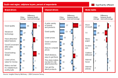
PowerPoint slides that are used to analyze data and solve problems inside a team are not always the best exhibits to be used in presentations. To illustrate the point, I am using a chart out of a publicly available McKinsey document: the
2008 Chinese Consumer Report published by
McKinsey's Insights China initiative.
The report itself is formated very nicely with beautiful pictures, the content of the report looks very interesting. I am just focusing on the cosmetics of one chart as an example. (
Click image for a larger picture)


- Overall, there is too much information on the slide, but given that this chart is used inside a long-hand document, that might not be too bad
- Because of the red background, the title does not stand out clearly
- The boxes around the chart are too heavy, to separate the 3 charts, it would be better to use a very light background shading
- The box on the right is narrower than the other two.
- Because there are so many bars in this slide, they become very narrow, and hence they almost stop helping the reader see the differences in size, maybe boxes with simple numbers work better
- The gradient fill of the bar does not add to the understanding the chart
- The legend in the top right looks slightly lost
- The text labels are too long: “the store makes me feel reliable/trustworthy” is appropriate for a consumer questionnaire, but can be shortened in the chart
- The text labels “dance”, they are not right aligned, some labels take 1 line, some 2 lines, some 3
- The middle graph has 8 bars, the other two 7, disturbing the visual calm of the slide
More posts on
McKinsey and management consulting presentations