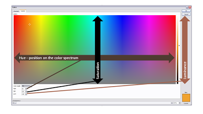
You can fill books about color theory, here I will take things one step at a time. How to set a non-standard color in PowerPoint?
First of all to enter the right menu: hit any fill, outline or font color drop-down and select "more colors". A big rainbow-like display will open. (Click the image above for a larger picture.) You have 3 options:
- Manually move the mouse in the color grid and click a color: this is never accurate enough. (Tip, you can actually stretch the window to make your selection more precise)
- Use RGB codes: a value of 0-255 for (R)ed, (G)reen, and (B)lue: it is impossible to predict what the resulting color of an RGB-combination is
- Use HSL codes, my favorite. Let's elaborate.
In the "color model" box at the bottom left of the matrix, change "RGB" to "HSL".
You can define a color exactly by changing the 3 variables, each ranging from 0 to 255:
- (H)ue is the position of the color on the spectrum, going from red all the way to purple
- (S)aturation determines how bold are faded your color will be. Fluorescent colors go for the full 255, pastel colors for a low value, if you make the value really low, all colors turn more or less into grey
- (L)umenance sets the shade of the color, from light to dark
In practice I hardly ever use this technique to set my PowerPoint presentation color scheme (see a previous post on how I do this). There are situations though you might have to use the HSL color model:
- Micro-adjust colors: "a bit more yellow in the orange" (more hue) to fine tune colors. Or to define clashing colors on purpose: create a second colors just a few nodges away from the original on the hue spectrum.
- Create color shades: I use lumenance a lot, it gives an almost endless array of color shadings that I can use in my designs. PowerPoint 2007 gives a standard spectrum of shadings in its default color menu, but if you run out, you can manually adjust the lumenance to get an even larger amount of colors to work with.
- Toning down light, bright colors. Highly saturated colors do not look good when you increase the lumenance. To have beautiful light shadings of these colors you need to take down the saturation.
SlideMagic: a platform for magical presentations. Free student plan available.

