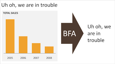
No need to put that huge "message arrow" on you slide
An excellent
post on the "Tekst en Communicatie" blog by communication expert Louise Cornelis. It's in Dutch, so I will translate.


Louise discusses what she refers to as "the big f*cking arrow" or "BFA" (not all Dutch on her blog). A huge arrow in the middle of the slide, pointing at a block of text with the chart's conclusion. Apparently "BFA" has become a well-known acronym among chart designers in The Netherlands.
Her (and my) recommendation:
get rid of it and stick to a clear title headline.