A daily dose of framework napkins
Yesterday's
post about Venn diagrams led me to a blog that I seem to be the last person on the planet to discover:
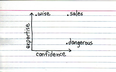
Indexed. Jessica Hagy posts a napkin-style framework everyday. Sometimes funny, sometimes with a valuable insight about life or an unusual way of looking at things. Here is an example:
 Venn diagrams, but
especially 2x2's, are very popular among McKinsey, BCG, Bain, and other management consultants. "We have put the world into 4 buckets, so now we understand it".
 Venn diagrams, but
especially 2x2's, are very popular among McKinsey, BCG, Bain, and other management consultants. "We have put the world into 4 buckets, so now we understand it".
For solving problems they are great, and I have used hundreds of them in my 17 year (oops) as a management consultant. All issues are on the map, how we can we move from one box to another?
But take a step back and think when you want to use these frameworks in a big keynote presentation. To illustrate my point: look at the drawings on the Indexed blog, and check which ones do you get in a second. Tricky isn't it?
My advice: use these 2x2 frameworks only
- if you want to show movement of dots in the boxes. For example you can use the same framework in a few slides to show changes in strategy, or the positioning of a company
- if you want to highlight how your company/idea differentiates itself from the competition (by being in the top right box).
Still, add Indexed to your RSS reader, it's great fun.