Adoption curves - how long does it take?
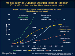
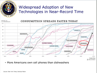
Adoption curves are a great way to compare the speed at which ideas spread, technologies were adopted or great companies were born. They are basic line graphs with the starting year set to zero. An alternative visualization would be a simple bar charts with "number of years before x reached y". While simpler, this approach loses a lot of information: the absolute size, the rate of adoption, and changes in the rate of adoption over time. The classic use is to show that new technologies are getting adopted faster and faster. A good example can be found in
Mary Meeker's 2009 Internet presentation:
 Mike Pulsifer found a chart that does not make all starting years zero, here is what happened:
 Mike Pulsifer found a chart that does not make all starting years zero, here is what happened:
Finally, interactive data visualization tools can add another dimension to adoption curves. See
this example of a chart that shows how many years it takes to transform a startup into a large company (thank you
Michael Eisenberg). The opening chart is far too busy to show in a PowerPoint presentation, but that's not the objective here. These charts are designed for pondering over: select and de-select lines, mouse-over data, etc. If you had to translate this chart into PowerPoint, you would have to use a number of slides to highlight the messages you want to stand out.
