Why does Helvetica look so great on a Mac and so poor on a PC?
I like the clean
Helvetica font in print material. I like the Helvetica font in presentations designed on a Mac. Somehow, the PC version does not appeal.
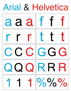
The answer is: it's not Helvetica. To save on royalties, Microsoft included the look-alike
Arial with its Office software suite. The fonts look similar, but there are subtle differences. And they make all the difference.
I have not solved the problem myself. I think none of my clients have Helvetica installed on their PCs, and despite
workarounds, I hesitate to create font issues with my presentations.
