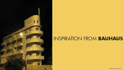
Finding font inspiration in Bauhaus architecture
More
presentation design and art today. I had a very clear policy on the use of fonts and typography:
- Do not use ALLCAPS
- Do not use non-standard fonts that can create problems on "foreign" computers
- Minimize the use of bold
Until now. I just finished a presentation:
- Set in ALLCAPS
- Using the Futura Bk font
- 90% of the slides are set in bold (yes, ALLCAPS bold)
The
Futura font family is to blame. The history of the font go back to the 1930s and its design is heavily influenced by the
Bauhaus movement. Clean geometrical shapes, look at these o's, almost perfectly round.
Maybe being located in Tel Aviv, a city that has one of the
world's most extensive collection of Bauhaus architecture, had something to do with it. The picture below is an example of a Bauhaus-style building in Tel Aviv, the "
Bait ha'Onia" or "Ship house" on 56 Levandah Street, designed by architect Arieh Cohen and built in 1934-1935. To make the side track complete, if you are interested in Tel Aviv Bauhaus architecture, make sure to get your hands on
this book (text both in French and in English).
Back to presentation design. In particular I like two font variations of Futura. The Light version (Futura Lt) for thin, elegant, sentences in sentence case, and the Book version (Futura Bk) for all caps. The allcaps look especially impressive in fat bold (look at the font in the image). Obviously, some of my old font design principles still hold. Allcaps bold fonts should only be used in presentation that contain a few words per slide.
The Futura fonts came standard with my Microsoft Windows XP Professional and/or Microsoft Office.
