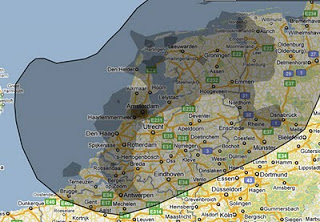
Relating the oil spill to your city of choice
More maps today. This simple site
ifthiswasmyhome puts the size of the oil spill in perspective... using a town of your choice. It would cover pretty much the entire Netherlands (the country where I grew up).
An excellent visualization, making people internalize what big numbers mean.
