Text columns in PowerPoint
Sometimes, you need to fill a PowerPoint slide with text. These slides are obviously not meant to be presented on a big screen. Still, I make them now and then; a legal disclaimer on page 1 of an investor presentation, detailed bios of the management team in the back, or a page of text in a PowerPoint document that is meant for reading rather than supporting a live presentation.
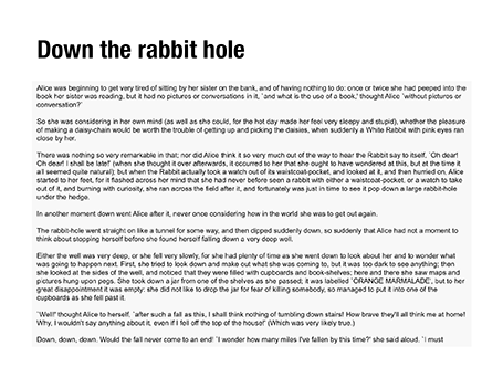
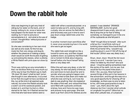
It is difficult for the eye to follow very long lines of text, because when the eye has reached the far right end of the sentence it has to move all the way back and find the start of the line below it. This gets hard with long lines. Also, long lines of text look ugly. Print designers discovered all this centuries ago, and invented the text column.
If you right click a text box in PowerPoint and select format text, you see that one of the options you can choose is columns (Mac). Play around with the number of columns and the white space in between them to get the desired effect. As an example, below are the opening paragraphs of Alice in Wonderland.

