
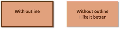
 I think PowerPoint shapes just look better without a dark line around them. A fill color that stands out from the background is enough. If you have to use a contrasting line, use either white or a dark shade of the fill of the shape rather than black.
SlideMagic: a platform for magical presentations. Free student plan available.