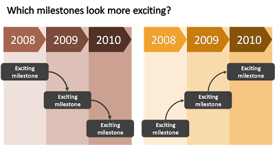
When designing a flow, always make sure that the direction of the eye is moving upwards to create a more positive feel of the slide. The horizontal orientation (left-right or right-left) is less important and depends in which part of the world you are living.
 I use flow charts often when I help startups pitch to a venture capital firm for funding. One of the final slides in the deck talks about milestones and future plans. Without revealing too much detail (in a 25 minute presentation the actual/precise/detailed content of the milestones is strangely enough less relevant, they can be discussed later), the chart should show upward momentum.
 I use flow charts often when I help startups pitch to a venture capital firm for funding. One of the final slides in the deck talks about milestones and future plans. Without revealing too much detail (in a 25 minute presentation the actual/precise/detailed content of the milestones is strangely enough less relevant, they can be discussed later), the chart should show upward momentum.
SlideMagic: a platform for magical presentations. Free student plan available.
