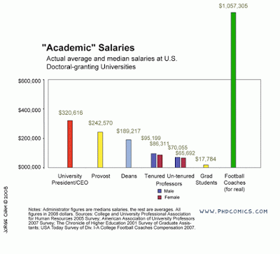
See this chart:
It breaks a number of rules. The most obvious one is the bar towering out of the chart frame. But hey, it helps make the point!
Original chart can be found on PHD Comics. I found it on Junk Charts
UPDATE: this chart does violate some other basic design rules that are better corrected, see an earlier post about cleaning up Excel/PowerPoint data charts.
SlideMagic: a platform for magical presentations. Free student plan available.

