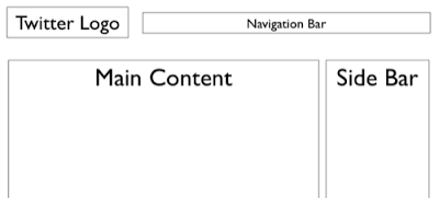
There is a lot of (white) space for self expression on Twitter in its background image. (Not implying that "cluttering it up" will make it look better though)
The "The Closet Entrepreneur" posted a tutorial how to create a Twitter background in PowerPoint. It includes a template with the areas you should leave blank for Twitter's own content.
 P.S.: follow me on Twitter.
Via Digital Inspiration
 P.S.: follow me on Twitter.
Via Digital Inspiration
SlideMagic: a platform for magical presentations. Free student plan available.
