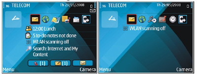
My wife had to swap her mobile phone because my 2 year old son decided to empty a bottle of water on her previous one. These things happen. The new phone is a Nokia E71. Phone reviews are a bit out of the scope of this site (it is a great phone by the way), but I can comment on the graphics of the user interface.
 PowerPoint and mobile phone interfaces are the same: the fact that you can make that sophisticated watermark background does not mean you have to use it!

Nokia could have done so much better:
- Like almost all mobiles, there is a busy wall paper crowding the display
- Overly sophisticated icons with random colors
- Different font (sizes), poorly aligned.
Mobile phone screens can also benefit from a "Zen" make-over to transform them into calmer and more minimalist user interfaces
SlideMagic: a platform for magical presentations. Free student plan available.
