Inspired by a post on slide:ology today linking to a set of newly released PowerPoint templates with examples of what graphical effects PowerPoint can produce, I decided to start posting some of my own favorites.
Many logos of Web 2.0 companies are examples of how not to use these graphics capabilities: add a "bevel", "reflection" and "drop shadow" and the result must look good. In graphics design, most of the time, less means more.
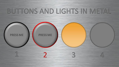
But sometimes these effects can help. In my case a client needing to explain software functionality. We decided to go for the metal "HiFi component" look with buttons that can easily activate functions. (Click image for a larger picture)
- Metal skin: an image purchased from iStockPhoto
- Metal text: a big font in a similar, but slightly darker color than the background with an interior shadow applied to it
- Button 1 and 2: a circle with a heavy outline (red or black), a simple "bevel" applied to it, but in the tab "3D options" of the bevel functionality I increased the depth to 20.
- Light 3 and 4: a circle without an outline, with an central interior shadow and a color gradient running from a full color to a slightly faded color.
Let me know in the comments if you are interested in the detailed instructions.
SlideMagic: a platform for magical presentations. Free student plan available.

