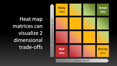
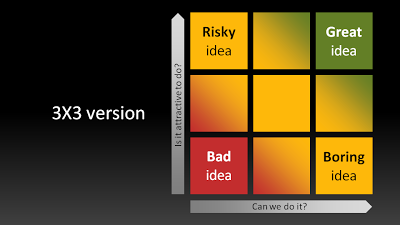
Not a grand presentation design insight today, but a quick sketch.Matrices such as 2x2s are often over-used. When you combine them with a heatmap, some colors and some gradients, you get a nice visualization of a trade-off:
UPDATE: to show that the big lines are not grid lines, here are the 3x3, 2x2 and 1x1 versions of the same chart:
UPDATE 2: I have added a heat map chart to the template store
SlideMagic: a platform for magical presentations. Free student plan available.


