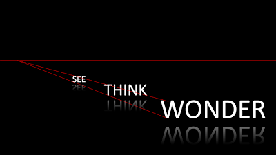
On today's SlideShare front page is a nice presentation by Martin Pure:
Following on yesterday's post on 3D objects, you can see that "something is wrong" with the alignment of the objects. The use of a reflection (a "Web 2.0" effect that I only use very rarely) implies a 3D setting.
You can apply the same guide lines thought to correct things. In addition, you can change the size of the font to emphasize the feel of a 3D environment.
My comments were all about positioning of text. Do not misunderstand me, I like this presentation.
SlideMagic: a platform for magical presentations. Free student plan available.

