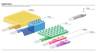
Infographics can look great, but can do a poor job in getting data across. This data could have been brought out better with simple bar charts. I am still struggling to get the point (15+ years of chart-decoding-experience as a strategy consultant is not enough in this case).
 Original on Good Magazine. Click the image for a bigger picture.
 Original on Good Magazine. Click the image for a bigger picture.
SlideMagic: a platform for magical presentations. Free student plan available.
