A user of PowerPoint 2007 has an enormous amount of 3D tools at his/her disposal. It is only after a year or so of working with this software that I start to understand how 3D could help get your message across.
 Other examples could be a landscape scattered with competitors battling for market share. Or a quadruple layer of defenses that can protect the intellectual property of a startup.
Many 3D effects are NOT useful. Three dimensional graphs make it harder to match the data to the value axes. Adding "random" bevels, reflections and shadows to a PowerPoint object does not make it an elegant graphical element. The fact that PowerPoint can do it, does not mean you have to use it.
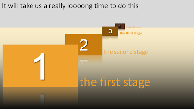
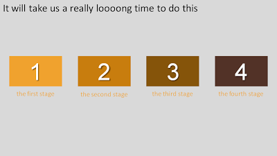
Why don't we use 3D for what it can do best: show distance? The example below shows a time line that we expect to last forever.
 Other examples could be a landscape scattered with competitors battling for market share. Or a quadruple layer of defenses that can protect the intellectual property of a startup.
Notice that you actually do not need any of the PowerPoint 2007 effects to create a 3D effect. It is all about positioning shapes, and reducing the size of objects and fonts as you come closer to the imaginary horizon.
Use 3D when you think two dimensions are not enough to tell your story.
SlideMagic: a platform for magical presentations. Free student plan available.

