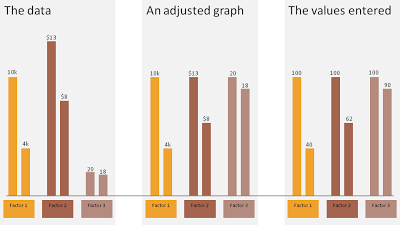
Sometimes you want to show 3 data sets in one chart with very different data ranges, for example:

- 1,000s of customers
- $ sticker price per unit
- Number of products bought per customer
One solution:
- Set the column of the first data point of each series to 100
- Calculate the 2nd value relative to the 100
- Manually paste data labels with the correct factors
The chart below gives an example:
- The first chart contains the unadjusted data
- The second chart shows the adjusted version
- The third charts shows the values I have entered in the PPT columns
Click on the example image below for a larger image.

SlideMagic: a platform for magical presentations. Free student plan available.
