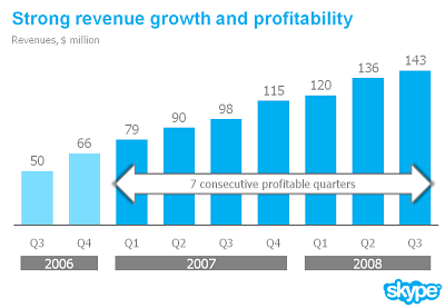
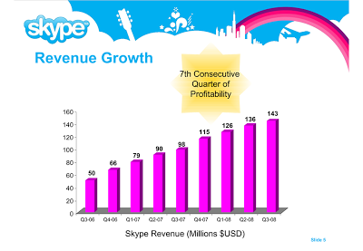
I am preparing a speech and needed a case example for a chart make over. Sorry to be picking on Skype again... A great color scheme plus a chart I discussed before. I have nothing against Skype, this is just for educational purposes.

- Reduce the template to a logo at the bottom right of the page, eliminating all other distracting elements. I really like white space.
- Rigorous application of the corporate colors and fonts.
- Simple column chart without 3D
- No need for a vertical axis if you use data labels
- Re-wrote the headline
- Replaced the yellow star to give the text more connection to the numbers (still it would have been better to show the actual profit numbers)
- Smiling, I made a typo in the revenues of Q1 2008
The idea is to make the data as calm as possible. Also note that through consistent use of corporate colors there is no need for additional "house style" graphical elements on the pace. You can see from a mile's distance that this is a Skype chart.

SlideMagic: a platform for magical presentations. Free student plan available.

