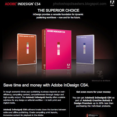
You would expect Adobe, the publisher of many design software packages, to be pretty good at designing print advertising. Not always. Have a look at this image that was featured on Photoshop Disasters.
Especially Adobe should have spent more effort to get the reflections right (see the right box), make the box shots look more realistic, and use better typography. This image looks like a poor "Photoshop", not the best way to promote the Photoshop software.
Leaving the technicalities of the ad aside for the moment, there is a broader lesson here. This ad looks exactly like PowerPoint slides that many technology companies use to promote their product. They can do better.
- A lot of headlines competing for attention
- Box shots (software is not a breakfast cereal)
- "White paper language": spelling out the product benefits explicitly using very generic statements that do not get internalized by the audiece: "superior", "dynamic", "competitiveness", "scalable"
SlideMagic: a platform for magical presentations. Free student plan available.

