Paintings are excellent inspiration for presentation design:
- Color schemes designed to provoke an emotion, often going against the rules of color theory
- Lessons in composition and page layout
- Ideas to give your presentation a distinct style or personality
The Dutch educational system plus graduate degrees in computer science and business administration have not contributed much to my knowledge of art history. I want to catch up quickly, but it turned out to be more difficult than I thought:
- There are many web sites devoted to a painter or a museum, I have yet to discover one that cuts across artists, locations, styles and periods in time
- The same issue is true for many art history books: one style, one painter, one museum.
- More-over art history books (surprisingly) have usually more text than images in them. Text full of elaborate interpretations by the author, that is clearly written with student education in mind.
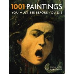
How happy I was to find this book: 1001 Paintings You Must See Before You Die .
.
Thousand pages of one painting per page, designed as a guide for museums to visit before your time on the planet is up (but then, there is no clear museum index, and many paintings are taken from private collections).
Leaving this small criticism aside, I found this book truly useful to digest a vast amount of images of paintings in a short time. Color picture, a bit of background on the artist, a bit of background on the painter. It contains both the block busters such as the Mona Lisa as well as lesser known works of art. Great.
Disclosure: I earn a small commission if you buy products from Amazon via links in this post.
SlideMagic: a platform for magical presentations. Free student plan available.

