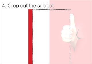
White space is a powerful element in slide design. An image with the subject in the center often does not leave enough space to let the slide breathe a bit. The following image sequence explain a work around. Basically, you stretch the background of the image without stretching and distorting the image subject itself. Flipping the cropped background makes sure that there is a smooth transition between original and stretched background.
Image via iStockPhoto.
SlideMagic: a platform for magical presentations. Free student plan available.


