Almost all my presentations (fundraising, sales pitches) start with some sort of description of a "pain" that needs to be solved. It is very tempting to go to a stock image site and fill the first page with an image of someone who is clearly suffering big time. I have been guilty of this as well.
I am moving away from this. Nobody likes to look at pictures of people in trouble. (Maybe this is a deep instinct, I remember how they use sounds of birds under great stress around airports to prevent them flying into jet engines.) Often these images are acted out and not natural. Using them takes the aesthetics out of your presentation.
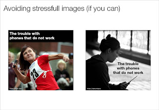
Below an example of 2 approaches. The left image is a contestant in a mobile phone throwing championship about to toss her handset into the air, I replaced her with a more neutral-looking mobile phone subscriber. The text in the image is illustrative.
Below an example of 2 approaches. The left image is a contestant in a mobile phone throwing championship about to toss her handset into the air, I replaced her with a more neutral-looking mobile phone subscriber. The text in the image is illustrative.
SlideMagic: a platform for magical presentations. Free student plan available.

