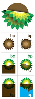
The BP logo was a very powerful one: an environmentally green flower/sun beaming with lots of positive energy. (Apparently it is based on the symbol of Helios, the personification of the sun in Greek mythology).
The fact that it was so good is proven by the enormous number of logo redesign contests that are being conducted now after the oil spill disaster. See this Google search. Here is one that offers a $200 bounty (still accepting entries), and here is a Flickr page with the entries from a contest organized by Greenpeace. The illustration below is taken from Draplin Design.
It is good to see that graphics design can spark so much emotion. Just a shame that is not a more positive one.
SlideMagic: a platform for magical presentations. Free student plan available.

