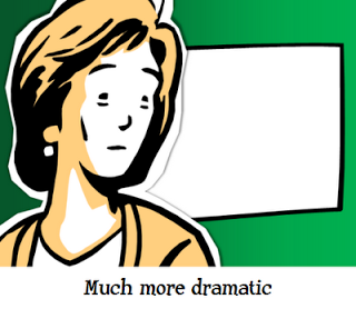
I have been avoiding clip art for many years in my presentations. The graphics look clumsy and cliche compared to a high quality stock image. (Sometimes I am longing for that screen bean though).
After reading a few posts on Tom Kuhlmann's Rapid e-learning blog I might change my mind though, maybe. All these big image, big text slides start looking sort of the same. Some ideas by Tom:
- Edit your clip art to make it interesting. Dramatically scale them up, so they become huge on the slide. Ungroup the object and remove items you do not need, or even swap heads on characters.
- Keep the style of your clip art consistent. I did not know that you can search for specific consistent clip art styles, this one for example: style 802. More examples here.
- Clip art is a good source to make black silhouette characters.
Add Tom's blog to your RSS reader if you are interested in this.
SlideMagic: a platform for magical presentations. Free student plan available.

