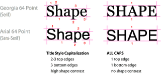
A very interesting analysis of why it is harder to read all caps text on UXMovement. All caps reduces the number of differentiators between words, and hence should only be used in short bites such as titles, logos or lables. I have been ranting about title caps as well before.
OK, sometimes I contradict myself, but all caps worked in this presentation with very few, short sentences.
OK, sometimes I contradict myself, but all caps worked in this presentation with very few, short sentences.
SlideMagic: a platform for magical presentations. Free student plan available.

