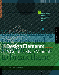
Recently, I have picked up a lot of books about graphics design and typography. Design Elements: A Graphic Style Manual (affiliate link) is a book that takes all the basic principles of graphics design one by one. It is built around 20 reminders for designers. Reminders and not rules, because designers have the opportunity to break them (see the cover of the book with 2 paragraphs of text put on top of each other).
Most books about graphics design use an incredibly complex language to describe visual concepts. This books is no exception. Rather than try to translate the text into concepts, I skimmed the prose and focused on the many beautiful illustrations, images, examples, and their explanations.
Things that I was reminded of (not as a graphics designer, but as a designer of business presentations in PowerPoint):
(By the way, my refusal to use proper apostrophes and quotation marks in blog posts puts me firmly in the box of non-graphics designers according to the book)
Most books about graphics design use an incredibly complex language to describe visual concepts. This books is no exception. Rather than try to translate the text into concepts, I skimmed the prose and focused on the many beautiful illustrations, images, examples, and their explanations.
Things that I was reminded of (not as a graphics designer, but as a designer of business presentations in PowerPoint):
- Think of which fonts you use (I am u-turning on earlier assertions that you should only use standard fonts in PowerPoint to avoid technology issues)
- Pay attention to the style consistency across pages in a presentation beyond just colors. Other things to watch are placement of objects, style of images, the way images are displayed, etc.
- Make sure your slide looks elegant, maybe even by reducing the font size somewhat and creating more white space around the slide. Margins do not have to be set at 0.4 inch all the time.
- Use color carefully, instead of "which color of the scheme have I not yet used on this slide"-type thinking, think about the distribution of light and dark, ask yourself where color is needed, and then pick the one that supports the slide message best.
- Try to incorporate rhythm in the design of a slide.
(By the way, my refusal to use proper apostrophes and quotation marks in blog posts puts me firmly in the box of non-graphics designers according to the book)
SlideMagic: a platform for magical presentations. Free student plan available.

