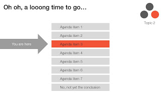
Many business presentations are loaded with tracker elements:
I am all in favor of structure, just let it come natural via your story, without having to "rub it in". One elegant solution is the full page separator slide like the ones I used in the IDU Biometrics presentation. They can contain a few words about what comes next e.g., "technology", or better you can write a question that wakes up the audience and makes them curious to find out more what's next: "why is this such a great biometric?".
- An agenda page with a highlighted bar that moves as we go from section to section
- A miniature version of a framework in the top right corner of a slide with a changing color highlight to remind people what we are talking about.
I find trackers great for big documents: it allows fast browsing if you need to refer back to material. In (shorter) presentations I try to avoid them:
- If you need trackers to keep people hooked to your story, your story is probably very boring. Maybe you can try to change the story?
- These top-right symbols add clutter to the slide design
- A big tracker agenda can come across daunting for an audience: "oh no, 5 sections before we get to the conclusion, let's check email on the Blackberry..."
I am all in favor of structure, just let it come natural via your story, without having to "rub it in". One elegant solution is the full page separator slide like the ones I used in the IDU Biometrics presentation. They can contain a few words about what comes next e.g., "technology", or better you can write a question that wakes up the audience and makes them curious to find out more what's next: "why is this such a great biometric?".
SlideMagic: a platform for magical presentations. Free student plan available.

