I have seen many presentations likes this one:
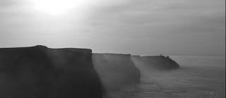
A great image of the Mohr cliffs by Christmas w/a K
- Stunning slide
- Stunning slide
- Boring slide
- Boring slide
- Boring slide
- Boring slide
- Etc.
A shame. It shows that the designers of these decks understand slide design. Why not push it through to the entire presentation?
SlideMagic: a platform for magical presentations. Free student plan available.

