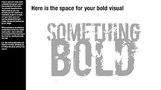
A presentation designed for a large audience with big images and few words cannot stand on its own without verbal explanation. Ideally, you would design two separate decks; one for the big audience, and one for emailing. But, constantly updating two presentations in parallel is time consuming and prone to errors. Here is a work-around.
Design your presentation for a 16:9 screen and add a text column on the left side. Put the full narrative of the slide in a tiny font. The email reader gets the full explanation of the chart. The big audience will see a blurry bar on the left of the slide, clearly distinct from the larger visual. You could go further and quickly delete the text bars a few seconds before you go on stage.
Not perfect, but good enough.
SlideMagic: a platform for magical presentations. Free student plan available.

