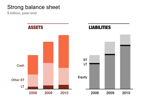
Financial statements are completely unsuitable to put on a PowerPoint slide: too dense, too much information. I like to use column charts to represent this information and dramatically cut the number of categories in the process. After a while, even accountants get used to it. The chart below gives an example of a balance sheet, in a real presentation I would add data labels rounded to 1 digit behind the dot.


SlideMagic: a platform for magical presentations. Free student plan available.
