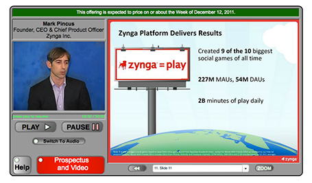
The Zynga IPO presentation is in the public domain, you can watch the video here. I watched the first 15 minutes of the presentation. Some comments.
Overall it is a pretty good presentation. The slides are organized, decently formated, the speakers are clear. And I guess this is what you have to do for a video-ed delivery about an investment opportunity that is aired for everyone to see on the Internet.
But what could be improved?
I think the presentation was taped with a tele-prompter as the only audience. The pace of speaking is constant. The result could have been better to put in a small live audience in the camera room, to make the delivery more real, more emotional.
Zynga must have many highly skilled graphics designers. I would shed the red border around the slides, get rid of the clouds in the title, but ad more game props and other graphics inside the slides to get the Zynga cartoon-like graphic style in the slides. The team slide with the cartoon characters and the logos of the previous employers is a good example.
The opening slide with the bullet points is an example how bullet do not stick. The slide gets put up. We look at the speaker, try to figure him out. We look at the background, the globe, the dog, start reading the points and note that the speaker is sticking exactly to the bullets. The content of the bullets does not sink in. The bullet slide could have been shortened and instead the opening shot could be focussed on just one message: we have Amazon in shopping, Google in search, Facebook in social, and now there will be Zynga in gaming for the next decade. If you want to invest in social gaming, there is no alternative but to invest in us.
Most investors will believe that the gaming market is big, that the mobile opportunity is huge. Some key advantages of Zynga are buried in the middle of the presentation. The difference with traditional revenue models depending on the opening weekend. The presentation uses terms like unmatched investment, infrastructure, platform, scalable, many times, but the meaning of it does not come across very well. (The key point is that Zynga built it, and no one will be able to catch up). Most important of all, the demo of a game itself comes in late. I guess is that many institutional investors actually never tried a Zynga game themselves. There is not better way than explaining social gaming by actually showing how it works.

Some extraordinary statistics are downplayed. The CEO puts up the 9 out of 10 social block busters were ours bullet points, but you only realize what it means when the more detailed chart comes up later. During a boring slide about the advertising revenue model, the COO talks about an amazing story of how gamers built 8 million Best Buy stores. The audience is reading how advertising is 5% of Zynga revenues.
In short, I tend to go against the investment banking practice of a highly structured investor pitch. Rather, I would keep the opening structure really short. Feed some really exciting facts in the form of small stories and case examples, focus on those elements of the pitch that the public might not be aware of, and bring back the structure and summary investor pitch later.
Thank you Wouter Deelman for pointing to this story.
Overall it is a pretty good presentation. The slides are organized, decently formated, the speakers are clear. And I guess this is what you have to do for a video-ed delivery about an investment opportunity that is aired for everyone to see on the Internet.
But what could be improved?
I think the presentation was taped with a tele-prompter as the only audience. The pace of speaking is constant. The result could have been better to put in a small live audience in the camera room, to make the delivery more real, more emotional.
Zynga must have many highly skilled graphics designers. I would shed the red border around the slides, get rid of the clouds in the title, but ad more game props and other graphics inside the slides to get the Zynga cartoon-like graphic style in the slides. The team slide with the cartoon characters and the logos of the previous employers is a good example.
The opening slide with the bullet points is an example how bullet do not stick. The slide gets put up. We look at the speaker, try to figure him out. We look at the background, the globe, the dog, start reading the points and note that the speaker is sticking exactly to the bullets. The content of the bullets does not sink in. The bullet slide could have been shortened and instead the opening shot could be focussed on just one message: we have Amazon in shopping, Google in search, Facebook in social, and now there will be Zynga in gaming for the next decade. If you want to invest in social gaming, there is no alternative but to invest in us.
Most investors will believe that the gaming market is big, that the mobile opportunity is huge. Some key advantages of Zynga are buried in the middle of the presentation. The difference with traditional revenue models depending on the opening weekend. The presentation uses terms like unmatched investment, infrastructure, platform, scalable, many times, but the meaning of it does not come across very well. (The key point is that Zynga built it, and no one will be able to catch up). Most important of all, the demo of a game itself comes in late. I guess is that many institutional investors actually never tried a Zynga game themselves. There is not better way than explaining social gaming by actually showing how it works.

Some extraordinary statistics are downplayed. The CEO puts up the 9 out of 10 social block busters were ours bullet points, but you only realize what it means when the more detailed chart comes up later. During a boring slide about the advertising revenue model, the COO talks about an amazing story of how gamers built 8 million Best Buy stores. The audience is reading how advertising is 5% of Zynga revenues.
In short, I tend to go against the investment banking practice of a highly structured investor pitch. Rather, I would keep the opening structure really short. Feed some really exciting facts in the form of small stories and case examples, focus on those elements of the pitch that the public might not be aware of, and bring back the structure and summary investor pitch later.
Thank you Wouter Deelman for pointing to this story.
SlideMagic: a platform for magical presentations. Free student plan available.
