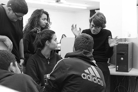
Last week I did my presentation design workshop to this year’s class of MEET (more details in an earlier post) in Jerusalem. I used grown-up stuff for these 15-16 year olds, a slightly modified version of my deck about investor and sales presentations designed for a senior managers. The results surprised me.
Despite being a 09:30am speaker (teenagers do not get a lot of sleep when they stay away from home in a large group), 95% of eyes were hooked on me (5% were deeply a sleep). In my usual audiences I rarely find someone really sleeping, but there are a lot more people distracted, even if your story is interesting.

Afterwards, I coached the students in the design of the pitch presentation of their ideas. It was interesting to see how these kids were sponges of ideas: the presentations were stitched together over the course of 3 hours and often looked better than finalized version 1s of pitch decks that clients sent me at the start of a project. The new generation has not been programmed by overhead transparencies and Microsoft PowerPoint bullet point templates, but is ready to try a fresh approach to design.
Teaching to present your ideas should be introduced in education much earlier than it is today.
Despite being a 09:30am speaker (teenagers do not get a lot of sleep when they stay away from home in a large group), 95% of eyes were hooked on me (5% were deeply a sleep). In my usual audiences I rarely find someone really sleeping, but there are a lot more people distracted, even if your story is interesting.

Afterwards, I coached the students in the design of the pitch presentation of their ideas. It was interesting to see how these kids were sponges of ideas: the presentations were stitched together over the course of 3 hours and often looked better than finalized version 1s of pitch decks that clients sent me at the start of a project. The new generation has not been programmed by overhead transparencies and Microsoft PowerPoint bullet point templates, but is ready to try a fresh approach to design.
Teaching to present your ideas should be introduced in education much earlier than it is today.
SlideMagic: a platform for magical presentations. Free student plan available.
