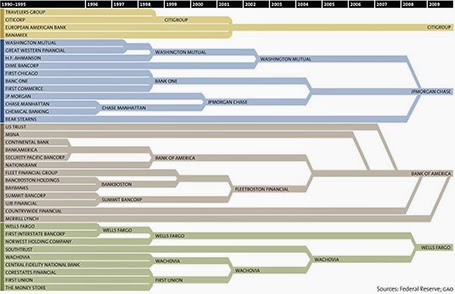
This is a nice way to show consolidation in an industry. You can digest the chart in 2 ways: on the podium you see the big picture of consolidating financial institutions, reading in close-up on the screen, you can see the details. The chart could have been better if the width of the arrows would represent the assets under management of the banks, some of these acquisitions were bigger than others.

[Off topic] There is a populist discussion going on in the comments of the original post. I did a lot of strategy work in banking mergers and there are different ways to look at the concentration in an industry. The top level player count is an easy statistic, but what is more relevant is the choice that customers (especially small businesses) have on the ground. How many different bank branches are within a 10km range at any point in the US? If there are 30 banks, but each concentrate on a specific state, then the market looks very competitive, but on the ground, customers face a monopoly. On the other, if all 4 banks are represented in most small villages, the market could be competitive.

[Off topic] There is a populist discussion going on in the comments of the original post. I did a lot of strategy work in banking mergers and there are different ways to look at the concentration in an industry. The top level player count is an easy statistic, but what is more relevant is the choice that customers (especially small businesses) have on the ground. How many different bank branches are within a 10km range at any point in the US? If there are 30 banks, but each concentrate on a specific state, then the market looks very competitive, but on the ground, customers face a monopoly. On the other, if all 4 banks are represented in most small villages, the market could be competitive.
SlideMagic: a platform for magical presentations. Free student plan available.
