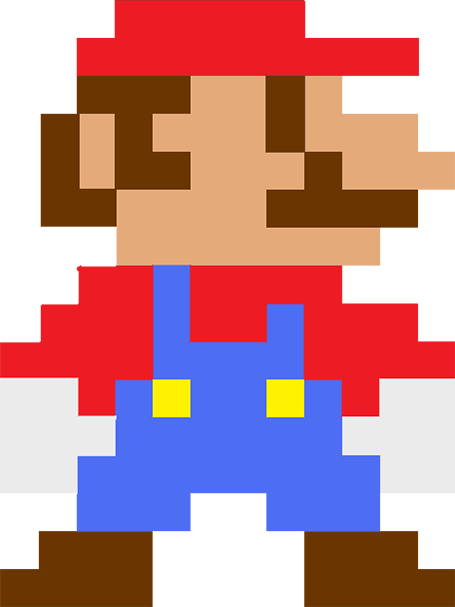
Nature prefers curves and round shapes. Steve Jobs likes rounded edges. White board sketches are curved and fluid. People prefer rounded shapes in architecture.
But: curved shapes are a pain to design. It is hard to fit text. It is hard to align them properly. They waste space (the Japanese invented the square water melon that makes better use of fridge space).

This is the reason that I “squarify” almost all diagrams and white board scribbles when designing presentation slides. Circles/ovals become squares/rectangles. Curved connecters become elbow connectors. Business presentations need to be efficient, and as a result they might not always be artistic master pieces.
But: curved shapes are a pain to design. It is hard to fit text. It is hard to align them properly. They waste space (the Japanese invented the square water melon that makes better use of fridge space).

This is the reason that I “squarify” almost all diagrams and white board scribbles when designing presentation slides. Circles/ovals become squares/rectangles. Curved connecters become elbow connectors. Business presentations need to be efficient, and as a result they might not always be artistic master pieces.
SlideMagic: a platform for magical presentations. Free student plan available.
