Sometimes, I still put slides in a presentation despite the fact that they are far too busy to be presented. Rather, these slides are there to be shown.
- A busy Gantt chart shows that we are completely on top of things and know exactly what we need to do the next 3 months
- An endless list of filed patents shows that our IP is rock solid
- Positive customer comment after positive customer comment makes that point that we are doing something right in customer service
- A really complex IT architecture that shows how clever the technology is
It is important though to spoon feed the audience what you want them to take away from the chart that is shown to them. You need to write the correct headline, or put the right emphasis with a big circle and/or arrow on what they should be looking at.
Another approach is to design the chart in 2 levels. Level 1 is the level for presenting. Colour coding and grouping elements together gives the big picture message of the slide that can be picked up by a keynote audience. The detail inside the dots (level 2) is interesting for a viewer who reads the presentation on a screen at her desk. Level 1 is the keynote slide, level 2 is the ponder slide.
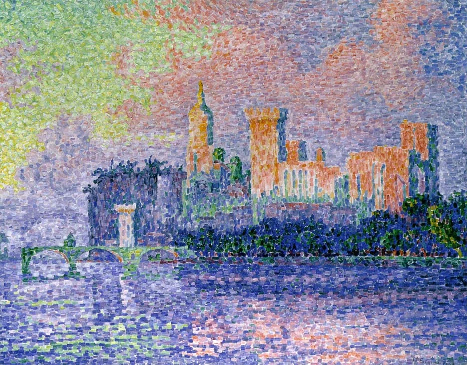
Art: Paul Signac, The Papal Palace, Avignon, oil on canvas, 1909, Musée d'Orsay

