I sometimes help out clients to clean up a very large presentation. Incorrect PowerPoint use, copying and pasting of different slide masters, and a less trained eye for design/proportions create slide decks that look inconsistent and "not right".
I created the presentation design app SlideMagic in such a way, that these mistakes are hard to make. Here is the list of actions I typically go through when cleaning up big PowerPoint files. (And this is also the list of PowerPoint annoyances [well, most of them] you do not have to worry about anymore when using SlideMagic).
- Locate the client's super clean template file and use it as a start for the presentation
- Go in the slide master view and delete all master slides you do not need (I am usually just left with a title page and a regular slide)
- Create slide templates with the correct title positioning for 1) empty page, 2) picture in frame page, full page picture page, and separator slide
- Create drawing guides (left, right, top, bottom, not centre and middle)
- Set the the default text boxes, shapes, and lines (font, colours)
- Copy the monster presentation into this new master file
- Select all slides in the presentation and apply the standard template slide (title, not text) to it.
- Font replace all the incorrect fonts to the right font with one command
- For each slide:
- Adjust the title text, so it fits in its frame, 2 lines maximum
- Resize shapes that should have the same height and width
- Make sure squares and circles have a 1:1 aspect ratio
- Reset the aspect ratio of distorted images (if possible), otherwise do it by eye
- Re-crop images
- Increase/decrease font sizes, adjust text if necessary
- Tone down the colours, make sure that things that need an accent colour, have one
- Make sure everything fits in the slide frame
- Realign and distribute the whole slide, centre/mid-align objects that need it
- Take out gradients
- Take out drop shadows
- Take out outline lines around boxes/shapes
- Round up numbers
- Make sure numbers line up correctly vertically
- Apply correct colours to data charts
- Reformat tables (colours, text alignment, uniform row heights, column widths, font sizes, make sure they fit in the slide frame)
All this work is:
- Time consuming
- Not the result of an original presentation designer's fault, it is just hard to get the details right
- Probably obsolete as soon as more changes are made to the presentation
People should be spending time crafting their story, and not making basic typographical adjustments. Give SlideMagic a try!
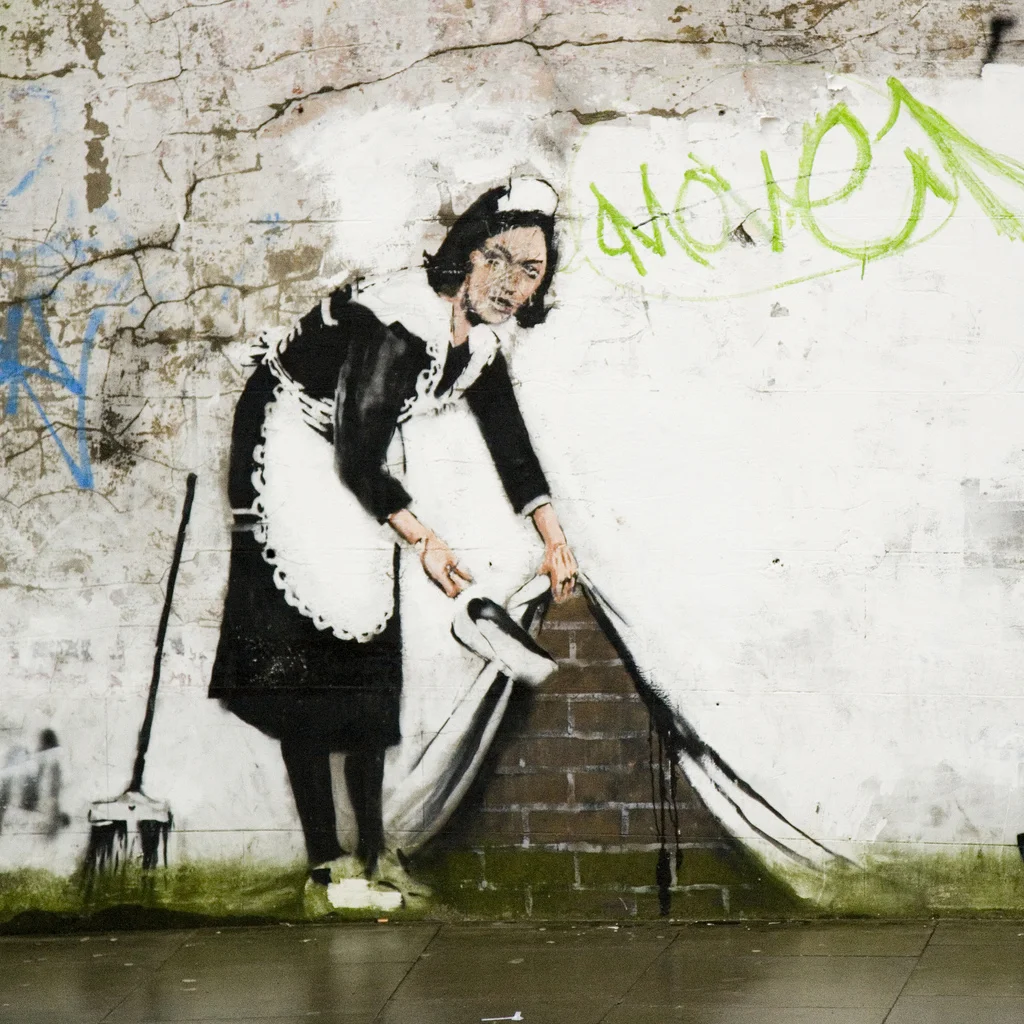
Image: Banksy, Street Cleaner, by Dan Brady on Flickr.

