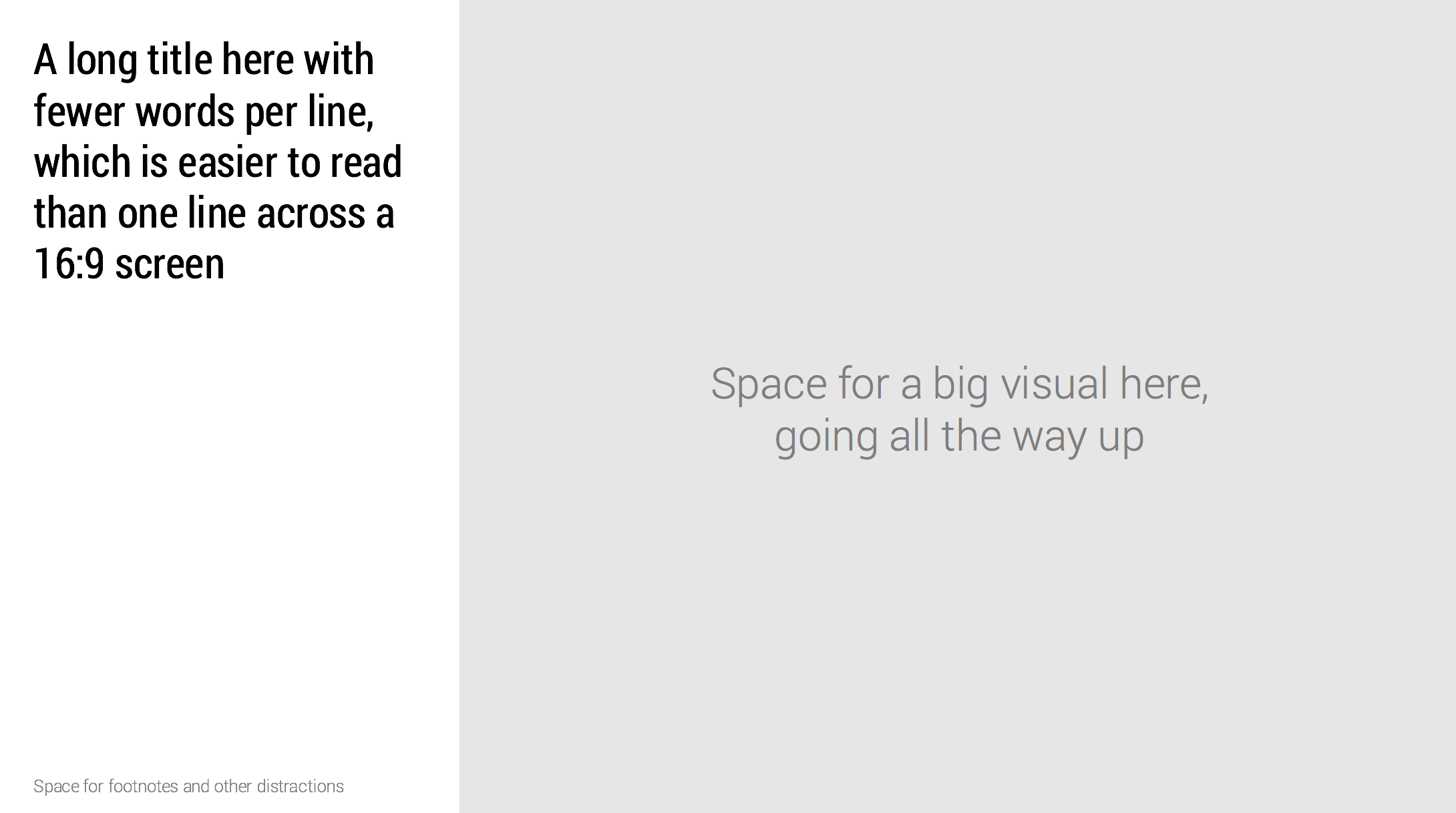
Wide 16:9 aspect ratios are great for movies as we can follow the car chase across the full width of the screen. For slide design however, they cause problem.
- Looooong titles across the screen are hard to read as the eye needs to move over a long distance
- A stretched rectangular design canvas limits the amount of compositions you can create.
Maybe it is time to experiment with an unconventional slide layout, where we put the slide title on the side of the design canvas.
In my presentation design app SlideMagic, I took a different approach. The app sticks to 4:3 slide aspect ratios, with a title in the traditional top position, but the user has the option to add a slide out panel on the right with a verbal explanation of the slide for those cases where the presenter cannot be there to explain an abstract visual.
Image from WikiPedia


