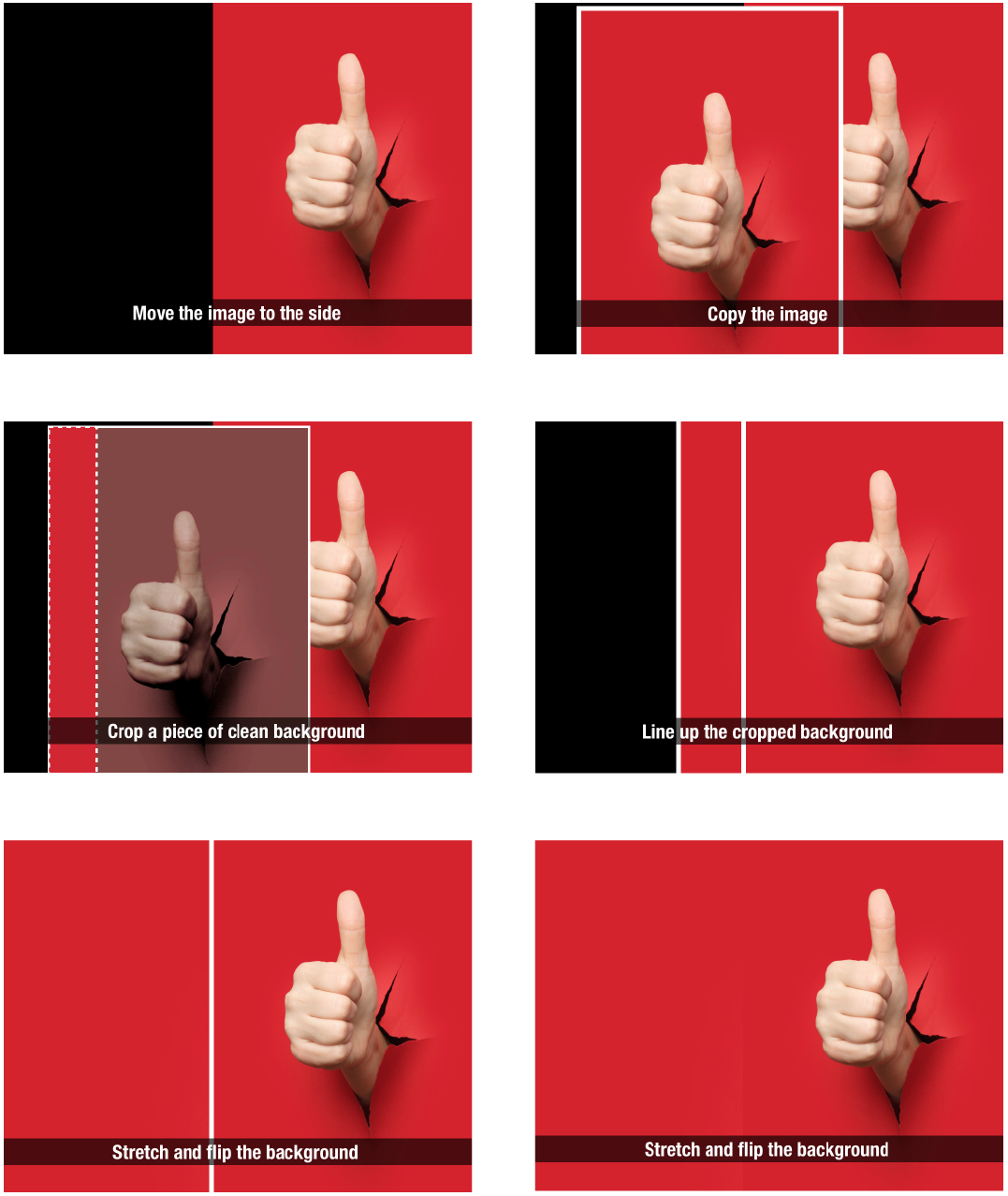
This is a totally obvious trick, but it took me a few years to get it. Flipping a big background image around its vertical axis to change the slide composition.
I like images with a subject off the center, creating a more interesting asymmetric composition and free white space for some text. The overall balance of the slide is set by a big headline, often at the top left. Certain images make the slide look tilted with all the weight on the left side of the slide. Mirroring your image will solve this.
Obviously you can only do this when there is no visible text in the image. In that case you might have to zoom in/crop the image to change its composition, or a bit more advanced, extend the background somehow either in Photoshop, or copying the image, cropping out the background on one site of the copied image and place it to the left of number one. This only works with very even backgrounds (a clear sky for example). See an example of this technique in the images chapter of my book.


