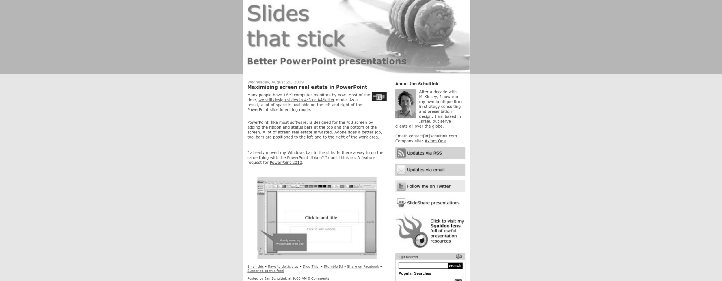
I was looking back at my old site on the Wayback Machine the other day and noticed how my approach to presentation design has changed. Back then, I would put huge efforts in finding unusual images, study advertising design, push PowerPoint to its limits. The result: some pretty unusual presentations.
Today, I have become much more pragmatic: presentations should be easy to understand (which might mean cutting that exotic visual metaphor), have a pro/no-nonsense look, and very easy/quick to put together, there are more important things to do than battling presentation design software.
Have I become lazy? I don’t think so. Just a more realistic and practical approach to presentation design.

