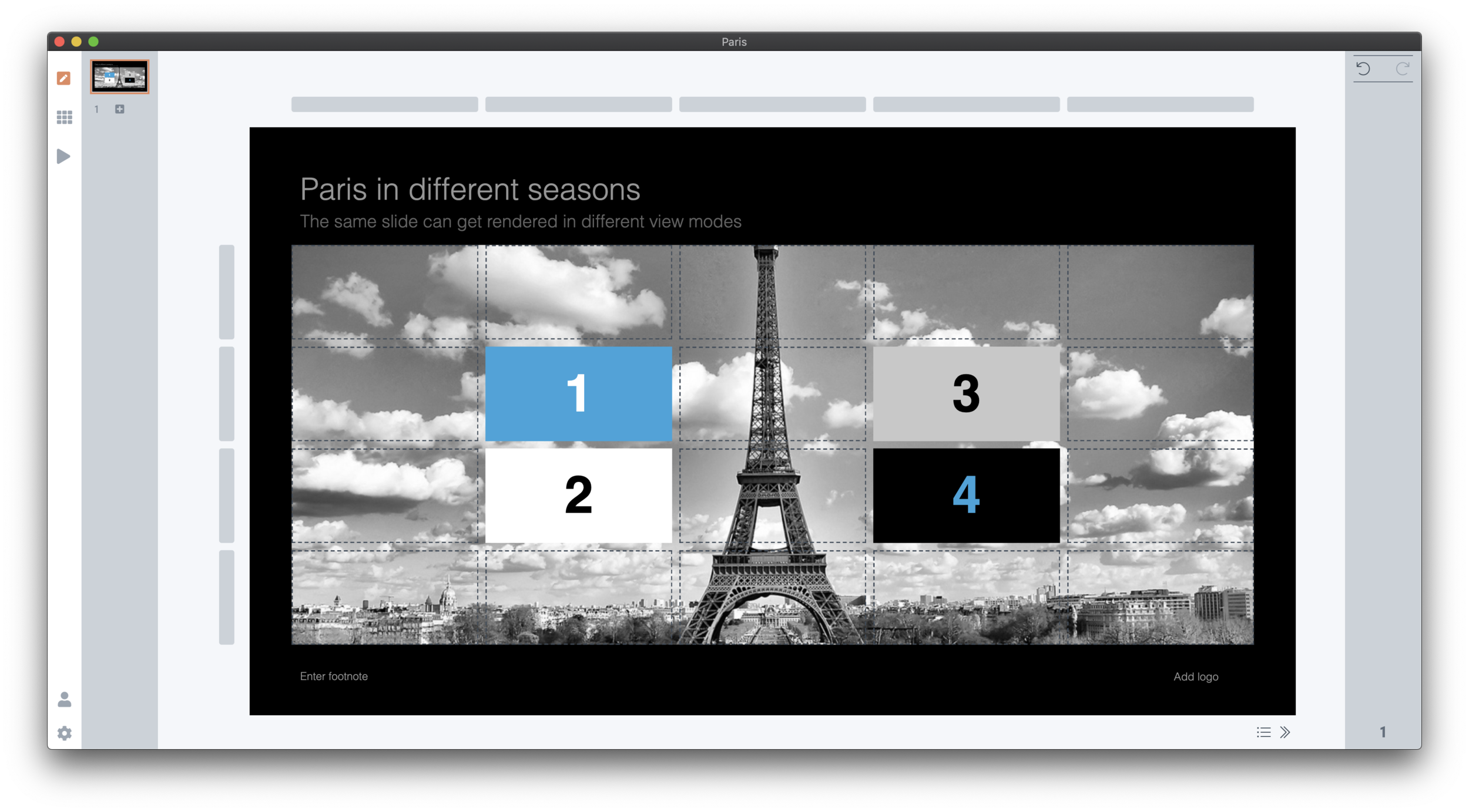
SlideMagic can change the way a slide looks at the touch of a button:
Aspect ratio, going back and forth between 16:9 and 4:3
Background colour: between dark and light
Explanation panel: with or without a side box with space for text for when you are not there to explain the slide in person
In traditional presentation software, this can be cumbersome to do. The software is not to blame, it is by design. If you give the user full flexibility about how to place images, size shapes, and colours she can use, you cannot avoid stretching of image aspect ratios, mixing up slide layouts, and confusing colours when you apply changing to a slide layout. Yes, all can be fixed, but it always takes a bit of mopping up to get right.
SlideMagic has a very rigid colour and slide layout regime, and it pays off, you can go back and forth between different slide layouts instantly. Here are six versions of the same slide, all generated with a single click without corrections:
4:3, dark slide background (see how the app interface itself turns light to provide enough contrast)
Dark background, with the slide-out panel
16:9, dark background
Wide screen, with a light background, the app turns dark again
Light background, with a slider
And back to 4:3, with a light background
The great thing is that all of this works on all the templates that are in the SlideMagic database. At the moment, thumbs will show up on the web site or app search interface in 4:3 with a light background. (This Paris slide can be found here). I have the technology to render slides on the demand (aspect ratio, colour, and even your own logo and corporate accent colour). I store slides a dynamic database objects, not template files, but I need to understand the implications on bandwidth and server processing before I switch that on.
To be continued.


