

Reading out endless slides with endless lists of incoherent bullet points is the ultimate disaster presentation. But bullet points can happen to the best of us, and I admit that I am still designing bullet point slides here and there in my client work. But not all bullet point slides are born equal.
When to use bullet points. Bullet points are a list or a ranking of some sort. When a product has 3 features; it is fast, cheap, and beautiful, or an agenda has 5 discussion points, or a project plan has 4 steps, or you have 3 key priorities for next year, it does not make sense to spread each point out as a different slide. The message of the slide is: we have 3 competitive advantages, which is different from: 1) we are fast, 2) we are cheap, 3) we are beautiful.
A bullet point chart is often a set up for more elaboration to follow. We introduce the 3 points, then immediately click through to the next 3 slides that will take each of these points in turn.
When you know you should not use them. There are a number of pointers that tell you your bullet point slide does not express a message of a list or ranking, but rather it is a list of speaking points.
- The points are merely paragraphs in a story. And then this..., but that..., taking into account this..., we tried these...
- The points are not roughly the same length, bullet 2 is 3 sentences, bullet 5 is 2 words, the bullets are not similar
- Related to this, the bullet points start to become complicated sentences / stories in their own right, you are not able to understand them in a second.
- Again, related to this, you are in the wrong territory when your points take a lot of time to explain. Bullet one: "we are fast" followed by a 10 minute elaboration on acceleration times of competing vehicles with the "we are cheap" and "we are beautiful" still on the projector is the wrong slide for the message.
- Most of my bullet point slides have 3-5 points, with 5 already pushing it. If you need more, you are writing speaker notes, instead of designing a slide.
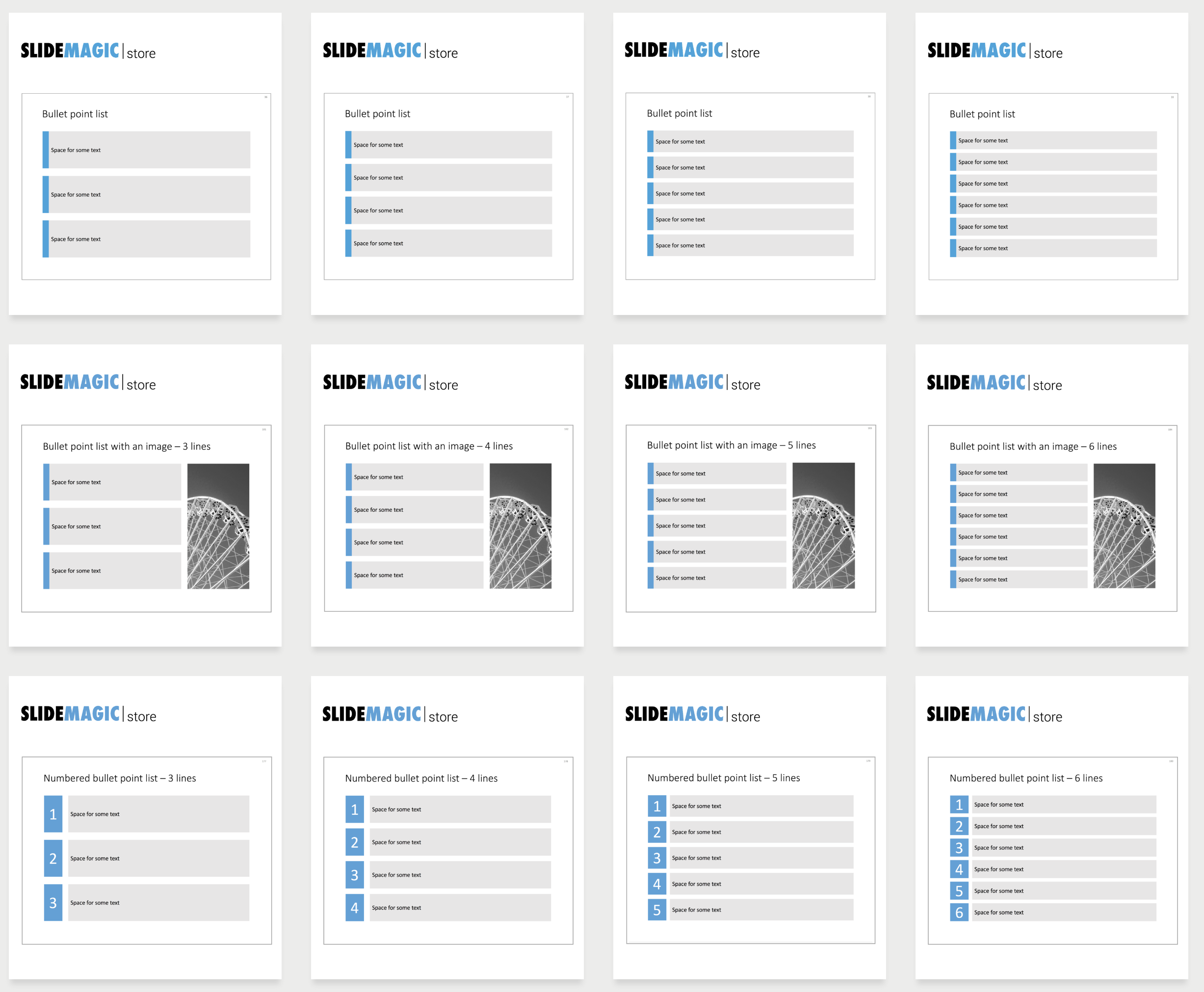
How to design a bullet point slide. The standard PowerPoint layout for a bullet point is really poor. The key thing is to stop thinking of bullet points as sentences, and instead consider them a grid of text boxes that take an equal share of the screen. Below is a screenshot of a search for "bullet" on my template store, which gives you some pointers on how to make bullet points still beautiful.
How to design bullet points in PowerPoint
The big pain of the designs above (and the pain of PowerPoint templates in general), is adding and subtracting rows and spacing and distributing all the points again. In my template store I solved this by offering multiple designs, but the real solution is in my presentation design app, which makes this process incredibly fast.
Cover image by The Creative Exchange on Unsplash