A quick post written on my iPad while enjoying my vacation here in beautiful Vietnam. I make a lot of Instagram snaps and here is the way I edit photos in the application.
I do not use the pre-installed filters, they are random permutations of image adjustments that distort my photo too much. Instead I go in edit mode.
The most important adjustment to any image is its composition: use zoom in/out, move left right, make sure the horizon is straight with the left most edit function. Then, on to brightness and contrast. Move the sliders and see whether your image improves or not. Next, highlights and shadows. That's it.
You see the functions I don't touch: saturation, color overlays, structure, blur, etc. etc.
SlideMagic: a platform for magical presentations. Free student plan available.LEARN MORE
After years of design work, many of my presentations start to develop a similar signature style or look-and-feel. (Secret: it looks remarkably close to the templates in SlideMagic). I think there is nothing wrong with that: you can easily recognise the work of famous poster designers, painters, architects. Presentation designers should be no exception.
I would encourage you to find your own signature style. Once you have figured out a distinctive way to make any chart look good, you are free to focus on its content. No need to worry about fonts, image crops, data chart layouts, and all the time to worry about composition, content, what image to put and what data to visualise.
Many people who read this blog are considering a career in the world of presentation design themselves, I get many questions about how I got to be who I am today professionally.
The answer: it happened somehow over many years, there was no deliberate career planning. Once I was free from a big corporate structure, you can shape the projects you choose to work on. Finding the first projects was hard, and the work I did closely resembled my strategy consulting work at McKinsey.
When you build up your initial base of happy clients, words start spreading and you get increasing freedom to pick those project that interest you. There is a reinforcing loop here: you do your best work in the type of projects you like, which gives you more demand for more projects you like. In my case, I loved presentation design work, and the prize was: more pie.
But. This transformation took years. It required a certain skill base to start off with (10 years of work experience in consulting in my case). At first, you get highly unpredictable income. As a freelancer, you need to like working on your own. A super-specialised freelance business is hard to scale beyond increasing pricing. (See Seth Godin on dumbing down/scaling up, I smarted up and scaled down).
SlideMagic: a platform for magical presentations. Free student plan available.LEARN MORE
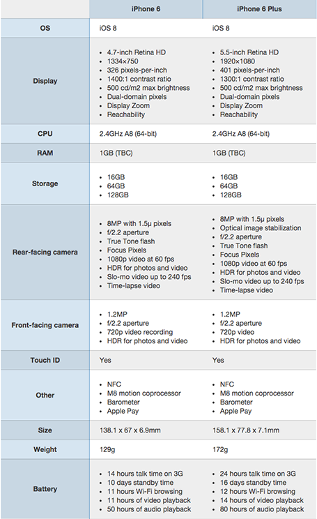
A nice side by side comparison of the new iPhone 6 and 6 Plus on the Cult of Mac. I see many of these tables in business presentations: columns with almost identical content. Why not focus on the differences instead and leave all the other clutter out?
SlideMagic: a platform for magical presentations. Free student plan available.LEARN MORE
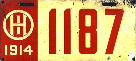
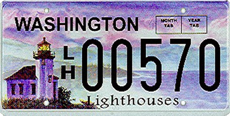
There is a parallel between the decline in license plate design as discussed in this article by William Morgan on Slate, and presentation slide design. Digital printing technology allows the addition of (background) graphics and unlimited use of colour. The result is a license plate that is unreadable and an ugly blob of graphical clutter on your car.
SlideMagic: a platform for magical presentations. Free student plan available.LEARN MORE
I realised that most presentation slides I create fall in two categories:
Data charts that have information in them that would be impossible to convey verbally (a graph, a table with financial information, a ranking of competitors)
Place holders with some powerful visual (picture, typography) and is merely a placeholder for the story told by the presenter
Things go wrong if you mix them: showing hard core data with a cute picture will not work, putting up a detailed consulting framework as your place holder will not work.
SlideMagic: a platform for magical presentations. Free student plan available.LEARN MORE
I usually start a presentation design project by digesting all the available information, listen to a verbal version of the pitch, Google for market and competitor information, create a slide template based on a straightforward slide (the profit and loss account for example), and let the whole thing cook in my mind for a while.
I know when I leave the “cooking” phase when I am able to draw up the key idea of the presentation in one slide. That one takes a long time to design, but when it is done, all other slides follow really quickly.
SlideMagic: a platform for magical presentations. Free student plan available.LEARN MORE
Seth Godin notices how - because of information overload - we have stopped reading/absorbing things with the full nuances, referring to “TL;DR”: too long, did not read.
You as a presentation designer need fight against this behaviour as well. Dense boring slides do not get attention, instead people apply their mental models and think they already understand what you are gong to say.
The obvious approach to this is to design visually attractive slides to grab people’s attention. But visually striking images is only half the work. Your story itself need to have interesting and unexpected turning points as well. An unexpected fact, an unexpected contradiction.
People do not really think something is too long: they think something is too boring to read: TB;DR.
SlideMagic: a platform for magical presentations. Free student plan available.LEARN MORE
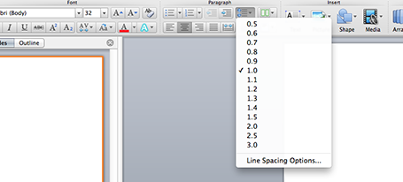
One of the typography elements I play with all the time is leading, the space between 2 lines of text. PowerPoint sets the leading standard to 1.0, or 100% of the typeface size. What leading looks good depends on:
The typeface you use
All caps, sentence caps or lower case
And most importantly: the size of the font, bigger fonts need less leading
There is no general rule here, you need to fiddle and see what looks best. On a Mac, there is a button that controls the leading of your paragraph, see the screenshot below. It is one of the buttons I use most.
SlideMagic: a platform for magical presentations. Free student plan available.LEARN MORE
Most sales presentations contain some logo page to show off your impressive client list. Make sure that the page looks impressive from a graphics point of view as well. An unstructured clutter of low-res logos makes an impression of an amateurish startup best to be avoided for serious business.
Check whether you got the latest logo of a client (visit the home page)
Use high resolution images
Where possible, use the logo that has a white background
Do not distort aspect ratios
Make sure the logos are more or less the same size
Distribute things evenly horizontally and vertically in a nice grid
Keep the page simple: just logos
If things look too busy, you can consider moving all the logos to black & white
SlideMagic: a platform for magical presentations. Free student plan available.LEARN MORE
It is difficult for a startup to sell to a big company. Even if your solution is really innovative, large companies prefer to work with financially stable, large companies.
The look and feel of your sales presentation can add to that nervousness in the under belly of a big-corporate purchasing officer. Looks to avoid:
Amateurish layouts with childish colours and water cooler fonts such as Comic Sans.
Overly cute, touchy feely, retro look and feel, especially when selling in a male-dominated corporate culture (sorry).
Now we all know that the a slick visual deck full of stories and very little text will do great in these meetings (option 3), but, there is one surprising other option (4): the big corporate, lots of bullet points, serious, boring slide deck. Purely from a look and feel perspective, you will fit right in with all the other technology vendors, unlike option 1 or 2.
If you cannot pull off option 3, option 4 is still preferred over option 1 or 2.
SlideMagic: a platform for magical presentations. Free student plan available.LEARN MORE
I am reading the book How to Think Like a Great Graphic Designer (affiliate link) by Debbie Millman (picked up at Rizzoli in New York, a great place to find design books). The book comprises of a series of interviews with famous graphics designers. Here are some common themes in all the discussions.
The process to getting to a good design is messy: you try, try, try, and then all of a sudden it happens (or not). Different from churning out analysis and data charts one after the other.
The standard career path for a graphics designer (start at the bottom in a big studio) inhibits success later on. Multiple designers spoke about finding a career setup that frees you from a big corporate structure in your formative years (a financial challenge).
You need to find time to do work away from the day-to-day pressure of a client. Again, this is a financial issue. Designers quoted lucky family situations and/or a large steady client as the enabler for creative freedom.
Pro-bono work often brings out the best in a designer, since “the client who is not paying has no right to interfere with the work”
Many designers are introverts, like to work by themselves, and stay in the front line of design work, i.e., they do not move into the management ranks.
Almost every designer talks about art versus design. I think deep in their hearts they regret not having made it as an artist.
An interesting book with many abstract concepts, it will resonate with somehow who designs day in, day out.
SlideMagic: a platform for magical presentations. Free student plan available.LEARN MORE
As I am slowly progressing with the design of my own PowerPoint alternative, I start to realize that phones and tablets require a fundamental rethink of what a user actually wants to do in a presentation design/delivery context. I have not cracked it yet myself either but am trying hard to solve the problem by trying to disconnect my thinking completely from how desktop presentation design applications have been set up over the past 30 years.
SlideMagic: a platform for magical presentations. Free student plan available.LEARN MORE
You have that big presentation coming up in a few weeks from now and you are a bit scared. It is easy to put off working on it, forgetting it, until a few days before the event. Wrong strategy.
Start the design process early on even if the brilliant ideas do not flow, then put it away for a while. Your subconscious mind will continue to grind on the presentation and you will be surprised what you can come up with later. If you start this process 48 hours before the event, this creative energy will never be released.
SlideMagic: a platform for magical presentations. Free student plan available.LEARN MORE
Many people claim that they now design TED-style presentations. They understand that bullet points are bad, and hey, it is actually very easy to put a word in white type on a black background (maybe even add that stunning image).
What many forget though, is that the substance of these TED talks is in the narrative, the story. Just having 10 slides that look like TED does not mean that your performance is TED-worthy. Sorry.
SlideMagic: a platform for magical presentations. Free student plan available.LEARN MORE
If that is your message, you can write the sentence “There are 45 applications” with a cutely formated 45 on a background of a stunning image. The other solution is to write out the applications in 45 boxes that are nicely spaced out over the page. The latter solution is more cluttered, but actually makes the point in a more convincing way.
SlideMagic: a platform for magical presentations. Free student plan available.LEARN MORE
When I get the brand guidelines from a client (explanations about logos, colors, fonts), the PowerPoint section is usually at the back, put there as an afterthought after brochures, business cards, and letterheads are being discussed.
Designers usually do not pay much attention to PowerPoint (PPT is uncool for serious designers) and you end up with fonts, shapes, and concepts that are 1) hard to incorporate in presentation design software (no, most people do not have Frutiger installed on their machines) and 2) - more importantly - are very hard to understand for the layman designer.
The face of a company used to be the letterhead, but today it is the website, and yes, the PowerPoint presentations that are cobbled together by the amateur designers and shown to customers everywhere, all the time.
So, when designing a new corporate look, think about those amateur designers, and the best way to do that is to design your look for PowerPoint, then adjust it to other canvases. Sorry.
SlideMagic: a platform for magical presentations. Free student plan available.LEARN MORE
There are 3 levels in presentation design understanding:
Spotting that a presentation looks really good (99% of people can do this)
Spotting that a presentation actually does not look good (this is still relatively easy, although a surprising number of people, including some who call themselves designers, are unable to do this)
Creating something that looks good, this is the really hard bit
A bit of modesty here: I too find myself stuck in level 2 often with my own work, pulling my hair out why it just does not come out right. In the end it is usually good, but it takes effort.
SlideMagic: a platform for magical presentations. Free student plan available.LEARN MORE
Venture capitalist Mark Suster has a blog with a large following, and is also active in producing video about venture funding and startups. A few days ago he hosted a live startup pitch for funding on his show. As I said before, I am a big fan of making (at least part of) the fund raising process more public. The 53 minute video is embedded below, I watched it and give some of my thoughts.
I have great respect for these entrepreneurs to be vulnerable and go with their pitch on video, and they were probably a lot more nervous than when sitting a conference room without a camera. I have made the comments below a bit sharper on purpose, in the hope that other people pitching for VC money can learn from them. In part I am helped by my Dutch/Israeli cultural environment where people use a slightly more direct style than in the US.
Look how Mark is forming an opinion about the business right in the first seconds. What is it that we talking about? Many investor presentation deck hold off the answer for too long.
The opening sentence full of buzz words gets cut short. Mark starts paraphrasing “Right, so you are a sort of eBay/Etsy widget for blogs”. It is indeed a better way of saying things, but hidden in this comment, Mark is already hinting at his major concern about the business. The presenters could have come out with a snappy/high-energy “OK, that you call it like that for now, but we have something amazing under the hood that makes us stand out in the middle of all these eCommerce giants, advertisers, and affiliate programs.”
Next thing, see how Mark is zooming in on the team. He asks them a very open question (tell me about your background) that gives his intuition time to size up these people, Mark just observes them more than he is listening. His attention for detail comes back when he asks questions about years. Are there holes in the CVs, are these people that have a success track record (or successful failures).
Mark wants to know how solid the team relationship is. The entrepreneurs could have read on his blog that Mark does not believe in startup competitions (people have not enough time to get to know each other before deciding to spend then ext 5 years of their life together. In the end Sahney responds to the challenge and says “Look, 5 weeks is not a weekend, and I know what I am doing”. Exactly the response Mark wanted. One more thing on team, listen how he probes whether there is no hard feelings about the decision who is CEO (Mark is listening and looking people in the eye).
Here Mark admits that he has already made up his mind. This is where pitchers need to stand on their feet. Guessing the major concerns and adjust the pitch to iron out the weak spots. It is hard to do I admit, to go off script.
Then comes the product demo, and it is only here that the big idea of the business comes out: the eCommerce engine is filled by the community of the blog itself. This should have been linked straight to the widget comment that Mark made upfront. Mark himself is actually drawing out a lot of the arguments for the business, clarifying points that the entrepreneurs make in more woolly language (everyone takes about community, engagement, when talking about social media and blogs).
My feel is that the first vertical segment that the team choose: mom bloggers does not resonate well with VCs like Mark. Just a personal style thing. You could strengthen how this technology could also be applied in less feminine content segments. (Mark himself starts talking about cameras, electronics).
Know the details. Mark probes with detailed questions about CPMs whether the team understand the fundamental business drivers of the business they are operating in.
The team interprets some of the business suggestions Mark makes as criticism. How you could help small bloggers with interpreting their visitor data. Mark is testing how these people would be to work with. Do they respond to ideas? Can they build on input? Can they admit that they are wrong? Sometimes, when Mark asks a question, the entrepreneur repeats part of an answer he has given before. You can see Mark getting a bit restless, and cutting over to another question. Sometimes it is better to admit that you do not know, or Mark had a great idea.
So, stepping back. I think the biggest lesson from this is to anticipate the big concerns that a VC will have with you, more or less admit some of these weaknesses, but have a story about you go about fighting against the odds. Part of that is technology and your business. But part of that is energy, will power, and enthusiasm that needs to jump across from the other end of the table. And maybe because of the uncomfortable video setting of this interview, that spark did not fully light up here.
As a feedback to Mark, do more of these video pitches, but find a format to make them shorter and punchier, that will make it more interesting for the video audience to watch, but increase the quality of the pitches and the interaction as well I think. I would not mind if Mark would be a bit less polite and a bit more direct. Still nice, but make it a real business discussion. Who knows, maybe one day Mark will host The Apprentice or American Idols for aspiring entrepreneurs...
SlideMagic: a platform for magical presentations. Free student plan available.LEARN MORE
I am continuing my quest through the long tail of Netflix design movies and stumbled on this one: Vidal Sassoon the Movie (affiliate link) about the famous hairdresser. In itself, his story is very interesting, growing up poor in an orphanage, and becoming a global celebrity.
For me, there were two things that I found especially interesting.
It took him 9 years to find his signature style that would change the way women looked (and thought of themselves) in the 60s. Design is hard work, even for the best and most talented among us.
He says that it is easy to see when something is wrong, but very hard to come up with something that is right.
This is exactly the case in slide design as well (at least for me). Learning to design is going through lots of your own failures, eliminating stuff that is not right, leaving you with the things that do. One way to accelerate the process is to plough through design books and absorb anything design around you. It increases the odds that you will bump into something that works.
SlideMagic: a platform for magical presentations. Free student plan available.LEARN MORE