Viewing entries in
Advertising

Proportions

Proportions

It is extremely hard to make a digital composition of multiple images look credible as a realistic scene. See in the ads below, the sizes of the objects are not right in relation to each other, and the angle of lens is inconsistent.

Alternative approaches:

  • An illustration

  • Make the actual shot in the field

  • Use proper 3D animation software

SlideMagic: a platform for magical presentations. Free student plan available. LEARN MORE
Vintage ad

Vintage ad

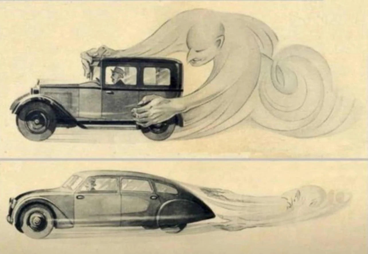
This vintage ad explaining the benefits of aerodynamics is making the rounds online. It is promoting cars by Czech manufacturer Tatra, which at that time, looked dramatically different than other vehicles.

Tatra could have been a very different car manufacturer today if the communist government did not force it to switch to building trucks…

A great resource for vintage advertising is the Vintage Ad Browser, careful with copyright though.

SlideMagic: a platform for magical presentations. Free student plan available. LEARN MORE
The case for not rounding numbers

The case for not rounding numbers

In 99% of slides, it is better to round financial data. $1.9m is easier to read than $1,898,456.34. Also the rounded number is more in line with a financial model that relies on rough assumptions. If you project your company sales in 10 year down to the dollar, you lose some credibility with your audience.

In some situations, the opposite approach can work. Look at this poster below of an Israeli anti-vax group who makes the argument that the money that is spent on encouraging hesitating Israelis to get a vaccine, could have been used better in a different way. (I leave pro and anti-vax debates out this blog, although you might guess in which camp I sit).

Here the big number actually works. Anyone looking at this big amount of money instantly starts comparing it to other lump sums you know: how much do you make as an individual in a year, how much does a car cost, how much does an apartment cost. Also, the precision and suggested accuracy of the number adds to the drama. This is a similar effect that National Debt Clocks try to convey.

The correct way to look at these numbers is to relate them somehow: $ per citizen, % of total corona-related cost, compared to other government advertising campaigns, etc. etc. After that, you might still conclude that it is high, but you used the correct metric.

SlideMagic: a platform for magical presentations. Free student plan available. LEARN MORE
Using brands in presentations

Using brands in presentations

It is usually hard to find good images of products made by well known brands that are of high quality, not obstructed by advertising copy and free of copyrights. Free photo site Unsplash is trying to change that by building up a revenue model where photographers post (and get paid for) posting images with brands in it. (Curated for quality by Unsplash and endorsed by the brand in question).

This is very useful for presentation designers. Looking for a nice Harley-Davidson motorcycle? Here you go.

I agree with Unsplash’s observation that advertising has deteriorated in quality over the years.

Screen Shot 2021-06-17 at 6.59.09.png
Screen Shot 2021-06-17 at 6.59.18.png

But on their own web site, they can do a bit better with ads for their new shareholder/investor….

Screen Shot 2021-06-17 at 6.50.27.png

SlideMagic: a platform for magical presentations. Free student plan available. LEARN MORE
The last page = a billboard

The last page = a billboard

That’s the one that is sitting on the Zoom screen for 30 minutes when you take questions. Here are things that are a bit boring to look at during that time:

  • THANK YOU!

  • Q&A

  • Appendix

  • A super detailed recap of the entire presentation in 15 bullet points

  • A super detailed Gantt chart of the next steps

  • The chart with your weakest data that you had to pull up to answer a question

  • The chart with the calculation mistake that triggered a question

The last slide is a billboard that can get engraved in people’s memory like a Super Bowl ad (with a slightly smaller audience). So better choices are a memorable visual that you used somewhere in your presentation to explain the opportunity, a nice product shot. Make sure you navigate back to it when needed.

Photo by Jaxon Lott on Unsplash

SlideMagic: a platform for magical presentations. Free student plan available. LEARN MORE
What the template says about you

What the template says about you

These food packaging make overs illustrate what is wrong with many of today's presentation templates: they make you look like you are "that kind of company". But remember, the hipster customer segment is likely to be a lot smaller than the mass market. Think about your audience, and whom you want to look like. 

SlideMagic: a platform for magical presentations. Free student plan available. LEARN MORE
How important is the logo?

How important is the logo?

Many early stage startups that need an investor presentation do not have a proper logo and graphical identity yet. Is this a bottleneck for a presentation?

Not really. I do not believe that you need to put your logo prominently on every page of your presentation. Hence, it is not very important in presentation design. The most important design element for a presentation is color. The color scheme will decide how your slides look.

So, pick a color scheme you think is appropriate for your business. It can be done very quickly. Every investor will forgive you if you decide to change it later. In the early days, you can simply use a text logo without any design to show your project's name. If you are not sure, a temporary project name can be a better solution than a poorly chosen brand name. That brand you chose late at night while brainstorming with the founding team might work great for you, but could be less optimal for your target audience.

Obviously if you are launching in the market than logo, identity and picking the right color becomes (a lot) more important.

SlideMagic: a platform for magical presentations. Free student plan available. LEARN MORE
"Messaging"

"Messaging"

People ask me whether I take care of the "messaging" of presentations as well. I do, but I do not really connect to the concept. Maybe it is because I come from the world of engineering and consulting, not advertising.

"Messaging" is often used in a marketing context for a consumer audience, not an investor audience. Should we emphasize that this gadget is beautiful, or powerful? In marketing presentation you would say "now in 3 gorgeous colors." In an investor presentation you would put a competitive analysis that show that the marketing strategy will focus on esthetics. 

"Messaging" is often the basis for a design process that revolves around words and sentences. How should we call the benefit exactly. What slogans to use. I tend to think visual, and like to brainstorm concepts visually.

"Messaging" can sometimes come in the form of a prescribed flow of a presentation, we finished the messaging, now "just implement it". Not my kind of brief.

"Messaging" can also mean sorting out the company/product positioning. This is a big piece of work that usually falls outside the scope of a presentation design project. No story, no presentation.

Source: http://tpdsaa.tumblr.com/post/3106513440/submitted-by-copyguy

Source: http://tpdsaa.tumblr.com/post/3106513440/submitted-by-copyguy

So do I do messaging? It depends.

SlideMagic: a platform for magical presentations. Free student plan available. LEARN MORE
Different interpretations

Different interpretations

Here is a picture of a bill board snapped by a friend on Facebook. Venn diagrams are very useful in presentations. But there can be a catch.

There are 2 possible interpretations:

  1. Intended: we are just so much bigger than these good things
  2. Version b: our values do not really include all these good things

Have you key slides checked by a few different people, especially if they go in front of many eyes.

SlideMagic: a platform for magical presentations. Free student plan available. LEARN MORE
Tone down the ambition

Tone down the ambition

Below is a professional print ad for Audi, trying to convince us that its heritage of cars is still present in today's models.

The concept is a very simple one. The way it is visualised is highly complex. To pull off something like the above requires a significant investment in a designer who knows what she is doing. Any attempt to DIY it will make your slide look amateurish.

But if you are not a global car brand with a million dollar advertising budget, you can still get that visual concept across.

  • A simple time line of cars
  • Overlapping circles with car images
  • Shapes around the current car with images of vintage cars

You can relax the ambition level of the type of visualisation you want to use. You cannot compromise on the professionalism of your slide.


Image from WikiPedia

SlideMagic: a platform for magical presentations. Free student plan available. LEARN MORE
Hillary's stock campaign video

Hillary's stock campaign video

The video in which Hillary Clinton announced her intention to run for President is too well executed. The messages are incredibly clear, you can almost reverse engineer the PowerPoint slide that contained the briefing bullet points for the script. 

But the execution is also staged and lacking raw emotion that it is unlikely to resonate with voters. I don't think it will leave a negative impression, just a neutral one. It sounds and looks like almost all advertising we see around us. This review on the Huffington Post captures it correctly.

In a similar way, Apple product videos, once admired, now almost look funny after the many parodies

A better way to do this? Interview "real people" on camera. It is a lot harder to do though.

It is a warning sign for those who think that big budget productions (videos, presentations) automatically translate into audience impact. The more people have been disappointed by slick presentations, photoshopped ads, spectacular videos, the harder it is to convince them that in your case they should believe you.

P.S. What do I think about the campaign logo? I don't think it is very pretty, but it will be very recognisable as an avatar on social media sites. Functional.


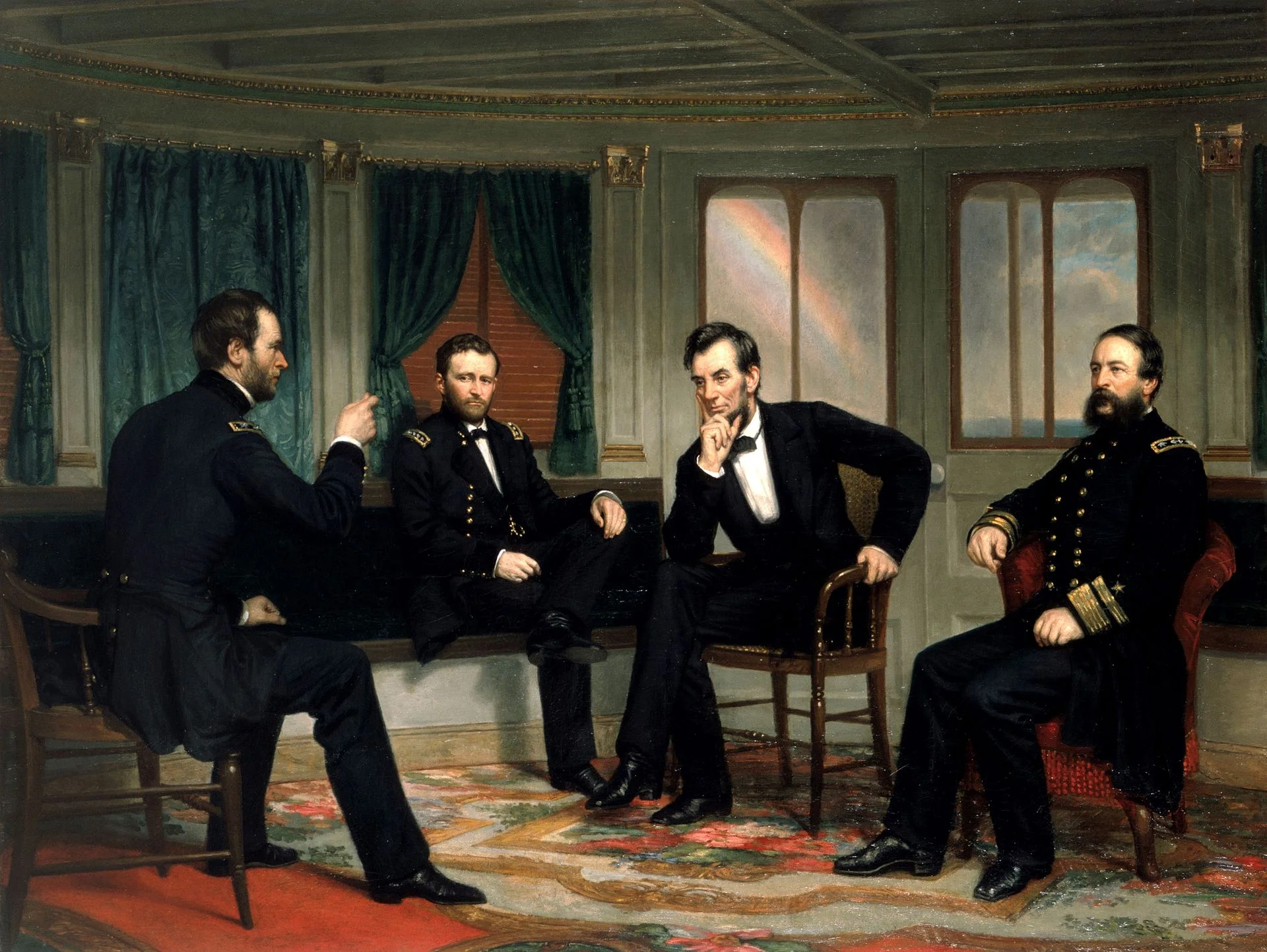
Art: The Peacemakers (1868) painting by George P.A. Healy

SlideMagic: a platform for magical presentations. Free student plan available. LEARN MORE