Viewing entries in
Concepts

Organized randomness

Organized randomness

While working on my 9xchange site, I used one of my approaches to present a document. “Pages” that sit randomly on a table or surface (see below).

I use this technique as well for the banner image of this blog, see below.

This effect is very easy to make. Take an empty slide / page in any presentation app. Save the document you want to show as individual images (good old screenshots will do as well). Drag the images on to the slide and tilt them. Add a little drop shadow behind them.

Things are not as random as they seem though:

  • The angles of the pages need to look interesting, not all the same, not too different

  • The page need to be semi-readable (i.e., not upside down)

  • Key headings should be visible and very readable

  • You need to decide whether to let pages bleed off the page, keep them 100% in the frame. It will create very different effects

  • You should select pages that look varied, and interesting and are presentative of the content of the document you want to show.

SlideMagic: a platform for magical presentations. Free student plan available. LEARN MORE
Work in progress...

Work in progress...

See the image below. I am blending AI-generated slides and images, and things are not completely right yet…

SlideMagic: a platform for magical presentations. Free student plan available. LEARN MORE
Prioritize your todo list, the Eisenhower matrix

Prioritize your todo list, the Eisenhower matrix

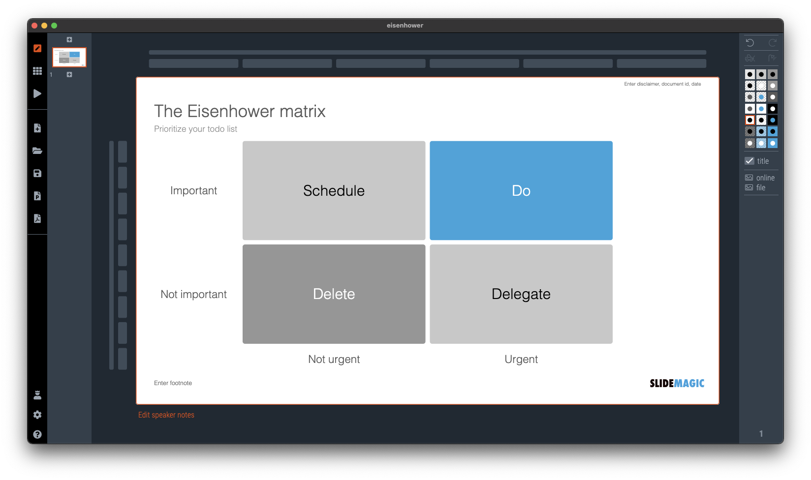
I was talking about prioritizing your time a few days ago and remembered a time prioritization tool that was suggested to me while at McKinsey. It turns out it is called the “Eisenhower Matrix”. I added it as a template to SlideMatic.

They key insight here was to be really rigorous and actually don’t do unimportant, not urgent tasks. The problem though was that all requests added to my desk were important and urgent….

SlideMagic: a platform for magical presentations. Free student plan available. LEARN MORE
An alternative calendar

An alternative calendar

Here is an interesting twist on the traditional annual calendar:

Image credit: https://bigthink.com/starts-with-a-bang/one-page-calendar/

Yes, it is a lot more efficient when it comes to the amount of space it takes (or the required font size to fit a whole year on a page). But I think the point of the big, dense, calendar is to schedule and plan things across the year. Also, you need to do a few mental steps to get your head around looking at a specific month.

I added a template with this calendar to the SlideMagic template library, search for “calendar” in the SlideMagic app and it will show up.

You can read the full discussion of this alternative calendar format here.

SlideMagic: a platform for magical presentations. Free student plan available. LEARN MORE
Table makeover: car emissions

Table makeover: car emissions

SlideMagic is back in 2023 after the holidays, and a very intense, exhausting and drenched JP Morgan Healthcare Conference in San Francisco (I will share some insights about pitching from this event over the coming days).

The starting point is this table:

What I did:

  • Use a stacked column chart instead of a table

  • Simplified the data to boil it down to what matters

  • Some fiddling to get the car images to a comparable scale (I hope I did it right)

The result is below:

I have added this slide to the SlideMagic template database so you can use it in your own presentations. Search for something like ‘BMW” in the app and it will pop up. Pro subscribers can convert slides like these to PowerPoint or PDF. SlideMagic has a free Pro plan available for students.

SlideMagic: a platform for magical presentations. Free student plan available. LEARN MORE
Joking about your own cliche slide

Joking about your own cliche slide

It happens to the best of us. Using a cliche chart. In a recent presentation, I had to refer to the so called “patent cliff”, a number of very big selling drugs will come off patent and become vulnerable to low cost generic alternatives. Everyone in the audience knows what it is.

I put an empty image (see below) of a cliff without any data or text, and literally apologized for the cliche visual. A 1 second reminder and * click * I could continue with the story

I have added this image to the SlideMagic slide library, search for “cliff” in the SlideMagic app and you can use this slide in your own presentation.

SlideMagic: a platform for magical presentations. Free student plan available. LEARN MORE
Related images

Related images

A well-chosen image creates a “visual shortcut”. While you explain your idea, the visual of the image gets stored in your brain alongside your story. Seeing the image again, immediately makes the whole idea pop up again, including its more complex nuances.

You can use this in presentations. Obviously on one slide. But it can also be very effective to use similar (or the same) image to make a connection between multiple slides. You introduce a concept early on (let’s say a problem) and when you get back at it later (with the solution), a related image can quickly pull back up the original story.

As an example, two slides I used in a recent presentation. The first image introduces the concept of FOMO (fear of missing out), in this case of a business that becomes wildly successful after you spun it out. The second image relates back to the slot machine / lottery concept.

If you are reading this blog post via an email update, you might have to open the link to the blog post to see the images. My email service can only take a limited amount of images from the blog feed (I am working to fix this).

I have added these slides to the SlideMagic template library, for example search for “gamble” in the SlideMagic app and the slides will pop up for you to use in your own presentation. Pro users can covert the slides to PDF and/or PowerPoint.

SlideMagic: a platform for magical presentations. Free student plan available. LEARN MORE
Agario-style

Agario-style

This amazing visualization shows the history of Europe and the coming and going of various empires in the style of the Agario video game, where bubbles collide and merge.

This video was made using Adobe After Effects. In theory you could do something like this in PowerPoint: a slide for every year with animations and then loop the whole thing. It is a lot of work though.

SlideMagic: a platform for magical presentations. Free student plan available. LEARN MORE
Mismatch

Mismatch

I am working on a deck for 9xchange (my other venture) at the moment, and I will post some concepts that I am using here on the blog (and add them to the SlideMagic library as well). Today, a nice zipper image to show some kind of disconnect between 2 things.

Search for “zipper” in the SlideMagic app and you can use this chart in your own presentations.

SlideMagic: a platform for magical presentations. Free student plan available. LEARN MORE
Chart template for a macro economic tree

Chart template for a macro economic tree

A quick make over of a chart that flew by on Twitter, explaining differences in GDP / capital between France and the US.

In SlideMagic, it is very easy to replace tabular data in bar charts. I have added this slide to the SlideMagic slide library, search for ‘GDP’ in the app and it will show up for you use in your own presentation.

SlideMagic: a platform for magical presentations. Free student plan available. LEARN MORE
Template request: process maturity

Template request: process maturity

A SlideMagic user requested additional templates in the area of organization design and benchmarking. I added these two upon request. (Don’t tell anyone the secret that these slide design request are usually put up within 24 hours after asking for them.)

Simply searching for ‘process’ in the app will reveal them, or search online via this link. Pro users can convert them to PowerPoint (students, did you see the free SlideMagic Pro plan for you?).

SlideMagic: a platform for magical presentations. Free student plan available. LEARN MORE
McKinsey chart make-over

McKinsey chart make-over

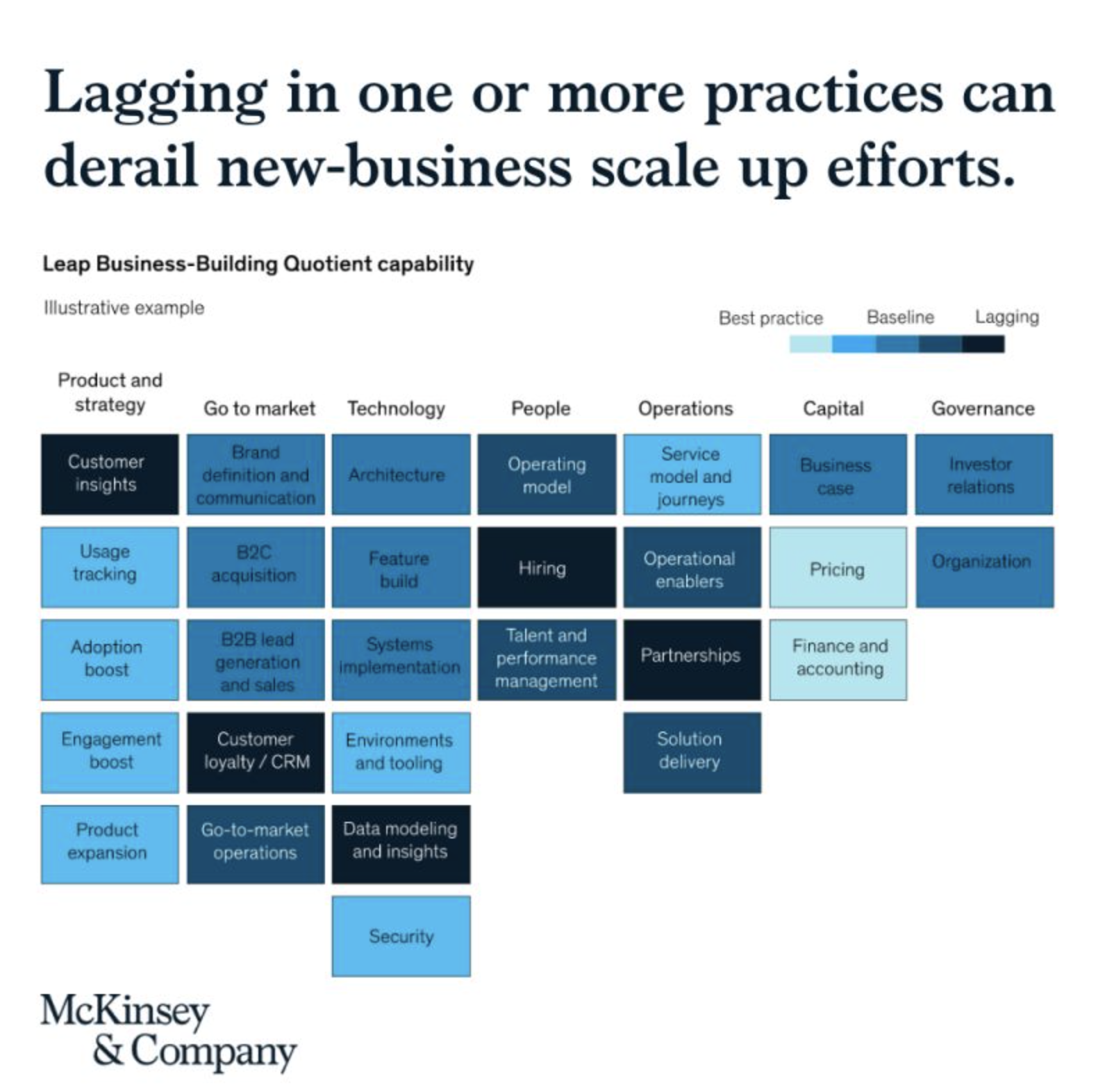
See the following McKinsey framework (background here):

The slide does not look bad, but there are a few things that I would change:

  • Flipping the columns and rows of the table, there are more columns than rows, I tend to put the axis with the most data in rows

  • Sorting the categories by number of boxes, to get a more visually pleasing line (McKinsey probably sorted the columns by importance)

  • Sorting the boxes within a category by color (and not by importance)

  • Fixing the color coding, the dark colour is actually the worst score.

Below is a quick makeover in SlideMagic, you can find this chart in the SlideMagic slide library for you to use.

SlideMagic: a platform for magical presentations. Free student plan available. LEARN MORE
Template: binary confusion matrix

Template: binary confusion matrix

I am dusting off my knowledge about machine learning and data science, and stumbled upon this handy definition of false positives, false negatives, and a bunch of definitions (I always find it hard to keep them apart). I turned them into a slide template that is not part of the SlideMagic library for you to use in your own presentations.

(I use this course if you are interested)

SlideMagic: a platform for magical presentations. Free student plan available. LEARN MORE
Understanding something tricky...

Understanding something tricky...

For another project, I had to get a better understanding of the blockchain and various encryption algorithms. This summary helped me a lot, how it is possible that a total “stranger” can verify the validity of a digital signature without sharing confidential information.

Still this explanation suffered from an issue with almost all explainers and technical presentations: certain critical steps that are blatantly obvious to the expert, but very hard to get for the novice get skipped over. The big online YouTube stars in education are masters in getting it right: anticipating what an audience is likely to struggle with.

Anyway, in the process, I added a chart to the SlideMagic library with the very basics of encryption:

Search for “encryption” in SlideMagic and it will show up as a slide template.

SlideMagic: a platform for magical presentations. Free student plan available. LEARN MORE
Scaling of data charts in SlideMagic

Scaling of data charts in SlideMagic

In SlideMagic, you do not have to worry about picking the right scale for your data chart. The entire chart adjusts itself to the numbers you type in. See the example below:

Screen Shot 2021-08-31 at 7.33.04.png
Screen Shot 2021-08-31 at 7.33.33.png

To make sure that a consistent scale is used for your entire chart, you need to place all your data points in one shape, instead of using multiple shapes for example for each month.

Screen Shot 2021-08-31 at 7.35.37.png

P.S. I have added this monthly sales comparison chart to the SlideMagic slide library so you can easily use it in your own presentations as well. Search in the app for ‘sales’ and it will pop up.

SlideMagic: a platform for magical presentations. Free student plan available. LEARN MORE
Shuffling

Shuffling

Another slide makeover. I will post the ‘after’ before the ‘before’, since the email delivery service sometimes does not render all the images I put in my blog posts…

And here is the original, created by The Information

Screen Shot 2021-08-10 at 7.32.15.png

What did I change?

  • I shuffled rows and columns to get the biggest possible continuous space of similar blocks, this is visually more pleasing, and groups/ranks players in a better way. (Hmm, should have swapped Instagram and TikTok now that I look at it).

  • I changed the colors, the traffic light analogy does not really work here. The “yes” and “testing” should be very similar in color, while the “no” should be a clear gap.

  • I added a more punchy headline

  • I calmed the whole chart down by simplifying the legend and taking out the logos.

I have added the slide to our template bank. Users of SlideMagic (try it, there is a free version), can access the slide by searching for “social” in the template bank.

SlideMagic: a platform for magical presentations. Free student plan available. LEARN MORE
Busy economics slide in SlideMagic

Busy economics slide in SlideMagic

I stumbled on the slide below by @ING_economics.

Screen Shot 2021-04-21 at 15.16.25.png

This is a slide intended for reading, rather than serve as the backdrop for a TED Talk. It can be improved on a number of fronts:

  • Move the aspect ratio to 16 x 9 to make more space for text in the boxes

  • Actually reduce the font size (we are reading anyway), to make the text fit better in the boxes, with more white space, and less irregular sentence wrapping

  • Make the rounded edges less extreme

  • Make the dark colour accents a bit less strong

  • And most importantly, fix those misalignments that make me cringe…

I did a quick re-do in SlideMagic, with is particularly powerful when it comes to text tables. I added the slide to the SlideMagic library, search for “economics” in the desktop and it will show up.

Screen Shot 2021-04-21 at 16.35.58.png

SlideMagic: a platform for magical presentations. Free student plan available. LEARN MORE
CMMI template

CMMI template

One of the users requested a template for the Capability Maturity Model Integration framework (more information on the site of ISACA’s CMMI Institute).

I worked of the following original (not created by CMMI):

Screen Shot 2021-04-18 at 13.04.47.png

Next to the general layout, there is also a lot of improvement possible in the text. Overlaps, and jargon can be removed. Here is the template that I added to SlideMagic, search for “CMMI” and it will pop up in the SlideMagic app.

Screen Shot 2021-04-18 at 13.07.15.png

This is my interpretation of the framework, and not endorsed by the Institute. But this reflects how I think you should treat all these diagrams by consulting firms, academics, and business schools: use and adapt them for your own situation. If the jargon does not make sense for you, take it out.

SlideMagic: a platform for magical presentations. Free student plan available. LEARN MORE
The five ingredients of a successful startup pitch

The five ingredients of a successful startup pitch

I added the slide used in this tweet to the SlideMagic library. In SlideMagic it is super easy to quickly create a grid with lots of boxes. There is a lot of redundant information on the slide, but the repetition on the other hand serves a purpose here.

Screen Shot 2021-04-11 at 10.17.42.png

Search for “pitch” in the SlideMagic app and it will pop up for you to use (alongside some other investor and musical pitch related slides).

Screen Shot 2021-04-11 at 10.16.00.png

SlideMagic: a platform for magical presentations. Free student plan available. LEARN MORE
Blocked! Fifteen puzzle slide

Blocked! Fifteen puzzle slide

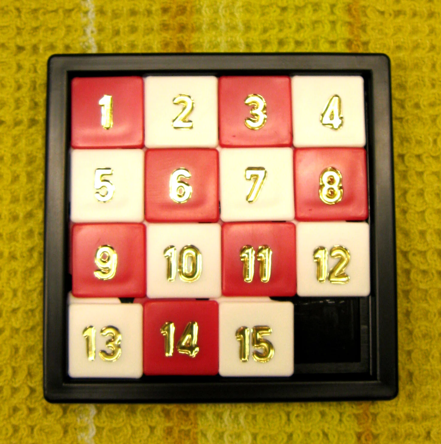
The fifteen puzzle was a popular download on the legacy SlideMagic PowerPoint template store (RIP). It is easy to recreate in SlideMagic 2.0 and I have just added it to the library of slides. Search for something like “fifteen” or “block” in the app and it will show up. This slide can be tricky to make in traditional presentation software as you need to get 16 boxes to line up nicely in a square.

Screen Shot 2021-04-06 at 6.31.19.png
Screen Shot 2021-04-06 at 6.45.18.png

PS: This is probably the only slide in SlideMagic so far where you have to make an adjustment when you switch aspect ratio. A wider slide layout will stretch the square into a rectangle. I added 2 versions of the slide to the library.

Image by Micha L. Rieser

SlideMagic: a platform for magical presentations. Free student plan available. LEARN MORE