Here is a slide I often encounter in draft publications: a screen shot of a news web page, with a few words circled in the middle of the article. There are a few problems with this
Viewing entries in
Concepts
Here is a slide I often encounter in draft publications: a screen shot of a news web page, with a few words circled in the middle of the article. There are a few problems with this
Decision charts. I added a few slides to visualise a decision or a trade off the store: simple boxes, the same boxes over an image background, and a minimalist scale
Merging flows. Here is a chart that visualises the merging of different flows. See in the second image what components I used to build it.
Sankey diagrams in PowerPoint. Sankey diagrams are tricky to make in PowerPoint, in the absence of a standard tool, you have to DIY the diagram from individual components. See below the approach I took to recreate a Sankey diagram in PowerPoint
Popping out of the box. Unlike many designers, I actually like framing my slides, leaving white space around the edges. Stretching your picture all the way to the slide boundary looks nice on one page, but creates inconsistencies with more traditional data slides, and reduces the readability of slide titles.
In the 2 images below you can see how to create a "fusion chart" where lots of stuff flows into something central. In the second image, I changed the color of the white triangles to grey and drew strong border lines so you can see what shapes are involved.
UPDATE: You can now download this slide concept from the SlideMagic store
Here is a picture of a bill board snapped by a friend on Facebook. Venn diagrams are very useful in presentations. But there can be a catch.
There are 2 possible interpretations:
Have you key slides checked by a few different people, especially if they go in front of many eyes.
I noticed this Tweet the other day of buzz words that are banned in the Conrad shop:
Banned words at the Conrad Shop!!! pic.twitter.com/s3MG8QUmrn
— Ben Page, Ipsos MORI (@benatipsosmori) October 15, 2016
"Visual story telling" is one of them. And I must say, there is something to it. (Yes, this is a professional presentation designer speaking). Yes, business presentations should be stories, yes business presentations should be visual. But when you find yourself in stuck in a meeting where 15 captains try to set the plot for a presentation, and you hear someone saying "let's take a step back everyone, and synthesize what we have brainstormed so far, so that we can spend the next hour doing visual story telling", you probably roll your eyes.
Buzzwords are created when you have seen useful concepts being abused too many times and visual story telling is joining the ranks of them.
It is hard to put your pitch at the right level. I often see two types of mistakes:
The best pitch is somewhere in the middle.
Image from WikiPedia
The bar is rising in presentation design. More and more people know how to design decent slide, more and more people know how to explain a business concept visually.
The challenge that remains is often a very specific point. In most cases, this is the answer to an "elephant in the room" question, a very specific answer to a question an ignorant but intelligent layman might have.
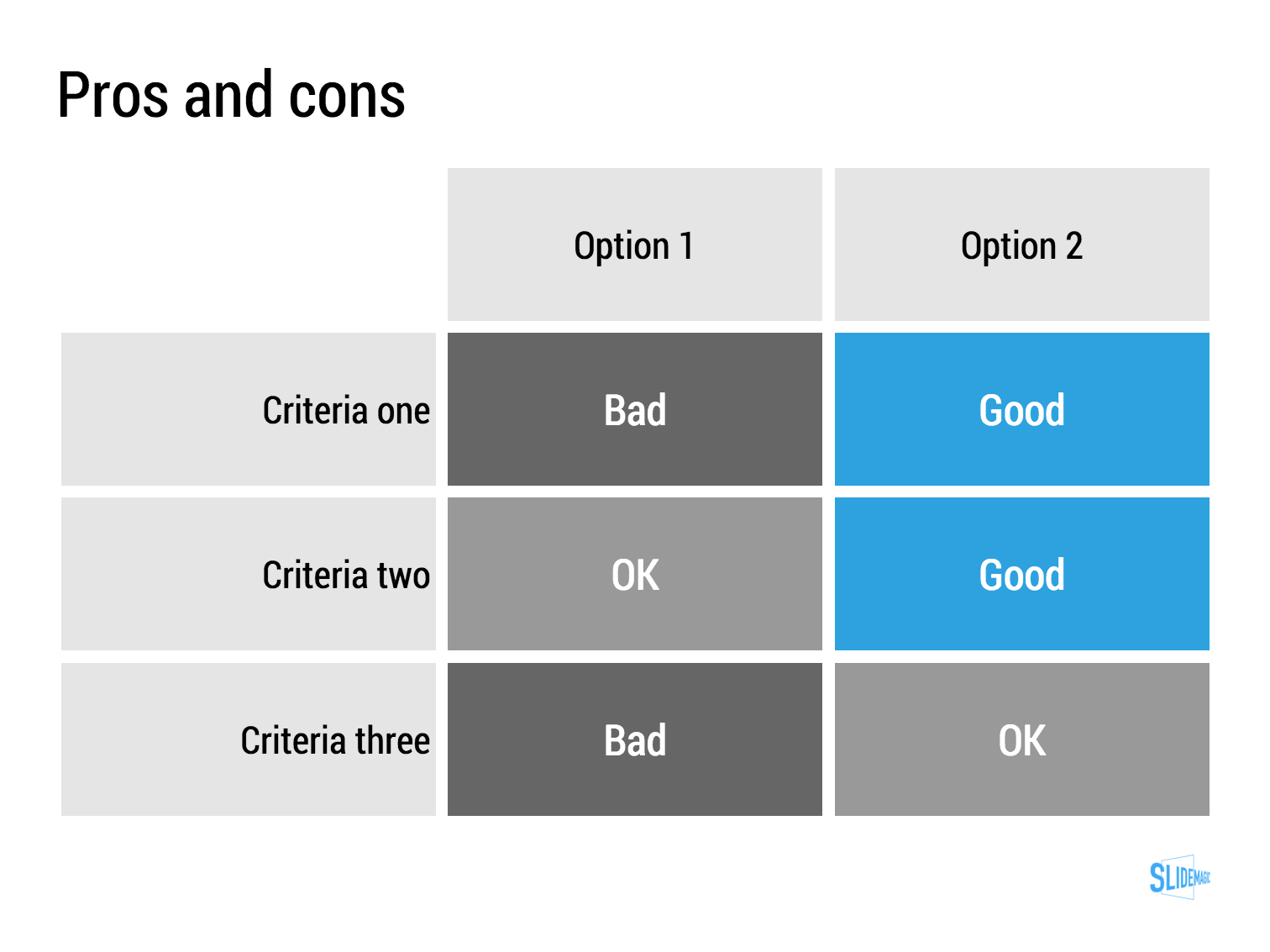
Most people burry these super important points inside a "standard" slide. "Oh, that is the point I make verbally when we present the competition slide."
I tend to make these points more in your face. Dedicate a specific slide to it. Even sometimes putting things straight in the headline ("No, we are not another Google").
These slides can be hard to design. The best approach is to listen really carefully when you explain it verbally to someone. "There are 3 groups of products, 1, 2, and 3, but none of them address y". "Gasoline engines can do x, but with electrical power we can do this.". "Up until now you could not see at nanometer level, but now it is possible". Look at the sentences and see what they do. Divide things in groups (boxes), contrasts between two options, "From to". Your language gives clues about what visual concepts to use. They don't have to be sophisticated, they just should be clear.
Image via WikiPedia
If this is the main message of your presentation, very few will believe you, unless you have a very credible explanation why you can offer a free lunch where others can't. "It is like magic" will not cut it.
Image by Eva Peris
The standard cloud shape in PowerPoint is not very pretty. Especially if you need a different aspect ratio, there is no option but to stretch the shape, making it look even worse. My solution is to combine multiple cloud shapes into one to get a decent new shape (SHAPE FORMAT, MERGE SHAPES, UNION). See the example below.
It is interesting to see that merging shapes also kills the "inside" cloud contours.
You can get more sophisticated and design your own cloud shape based on circles. Here is my attempt in 2011 to recreate Apple's iCloud logo in PowerPoint.
Art: View of Haarlem with bleaching fields, Jacob van Ruisdael, 1670
A question came in on Twitter the other day:
@ideatransplant How to discuss pros and cons of 4 things? What sort of layout would you prefer?
— Yoni Tantra (@yonitantra) January 3, 2016
My answer is: a simple table, like this one I prepared quickly in my presentation app SlideMagic (you can clone it to your own SlideMagic account in the presentation template file that contains on the slides I have used on this blog).
The difference between a good pro/con slide and a bad one is not the design in itself, it is how your present the argument. A presentation slide is a tool to get a decision, it is not a laundry list of pros and cons that you evaluated in your analysis. Put your analysis aside, and design from a blank sheet of paper:
Analogies are great. You take a concept that anyone can relate to, and use it to explain something unfamiliar. But you can push it too far.
Or, like in the Accenture ad below, you are actually insulting your target group.
Good analogies are pretty much the opposite of the above. They are simple, fit the subject, are easy to visualise, and ideally, can cover all aspects of your story.
Social media is full of inspirational quotes, and some of them make their way into business presentations as well. I am not a big fan of them. A few nice ones from Quartz:
“By maturing, we self-actualize.”
“We dream, we vibrate, we are reborn.”
“Choice is the driver of purpose.”
And now there is research that found a negative correlation between people who like these quotes and IQ (it looks genuine).
When are quotes useful in presentations?
It is not very often that you find one that matches all these criteria.
UPDATE February 2018: I have added a new post about using quotes in PowerPoint to the blog
Image: The book of nonsense by Edward Lear
I played around with the new "connectors" in my presentation app SlideMagic and used them to create a chart that visualises how multiple weak signals can come together into a strong one. I have added this chart to the SlideMagic template with charts that I discussed on the blog, you can clone it to your SlideMagic account here.