Viewing entries in
Culture

It's just a draft

It's just a draft

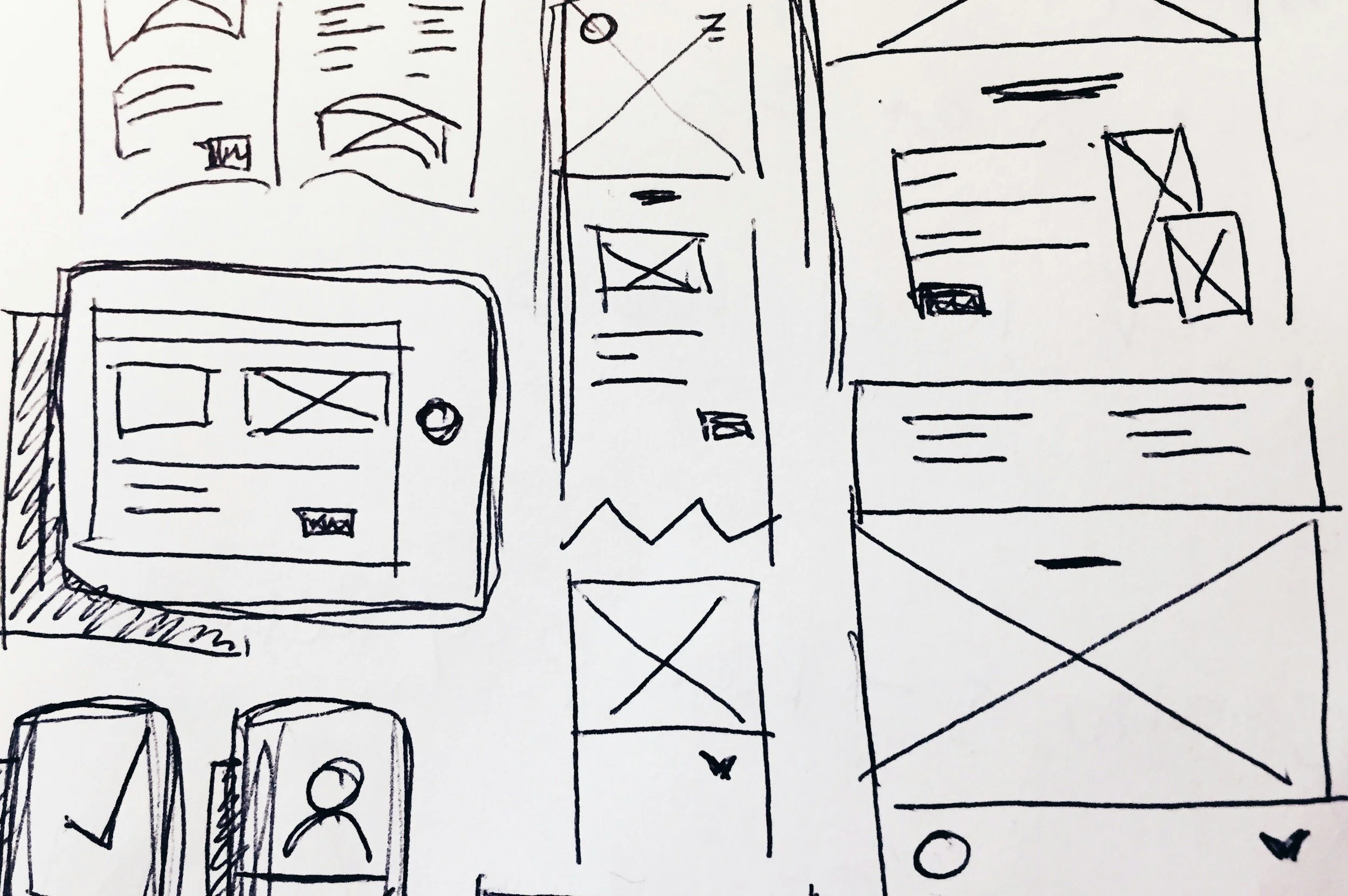
When quickly putting a draft presentation together, it is tempting to not spend any effort at all on design and layout. “We can always fix that later”.

I would argue the opposite. Make the draft look as good as the final product will be. It sets the entire mood for the project. Looking at messy / ugly charts is not a big motivation to do great work. Messy / ugly charts encourage people to add bullet point and too much text, because you can always remove it later.

The good news is that a simple chart with simple content does not take a lot of effort to design properly. Fix proportions, alignment and colors and everything looks great in a few clicks.

(Pro-tip: use SlideMagic for your draft documents)

SlideMagic: a platform for magical presentations. Free student plan available. LEARN MORE
Design culture

Design culture

It is tricky to get a big company all aligned behind one consistent approach to design. Twitter is going through a lot changes: changes in strategy, changes in people, etc. You can see it in inconsistencies in the web site. Colors, language, layout, icons,, other design elements, etc..

SlideMagic: a platform for magical presentations. Free student plan available. LEARN MORE
The cultural differences...

The cultural differences...

Communication cultures differ widely across countries. I experienced it myself in multiple situations:

  • Working as a Dutch national in McKinsey’s London office, people found me somewhat ‘blunt’

  • Living as a foreigner in Israel, I would sometimes be surprised that the first thing some says to you is “how old are you?”

  • Participating in a large Zoom call with many American participants who pretext a point of criticism or disagreement with a 1-2 minute apology before getting to the point

It is important to be aware of these differences:

  • As someone who is presenting

  • But also as someone who is in the audience and needs to put the presenter in perspective

Some of these differences might actually not be down to culture or character. Not all languages have words for specific nuances, so things literally get lost in translation: Language 1 has 5 options on a scale, language 2 only 2. If you are the native speaker in the 2-option language it is hard to pick (or even know) which of the 5 options to pick.

Read body language and ask for clarification when in doubt, or use some self deprecation to preempt possible issues.

SlideMagic: a platform for magical presentations. Free student plan available. LEARN MORE
Your true colors

Your true colors

My wife and I are pitching the services of (a still very) small startup (with a big idea) to some pretty big corporations. Big corporations are busy and overloaded with requests of small companies to talk to them. It is fine to play hard to get, but if you accept a meeting/call, don’t cancel at the exact minute the meeting is about to start unless there is some medical emergency.

The world is small and memory is surprisingly good. Personally, I had a few cases of poor interactions with people as a presentation designer (not paying agreed invoices for example) with people that re-appeared 5-10 years later with a request for another presentation (‘‘Hey, I am doing my own startup now and got a meeting with these investors next week, can you help?”), or were the subject of a reference call (‘Do you think I can trust this person with my investment?’)

Basic human interaction hygiene.

SlideMagic: a platform for magical presentations. Free student plan available. LEARN MORE
How to hire a design agency

How to hire a design agency

Hiring a creative agency is a bit different from negotiating with a building contractor or a car dealer. And talking to a small 1 - 2 person firm as a different story than dealing with a large design firm. Let’s talk about hiring a small firm (I used to be one these myself).

A good designer is busy and can basically decide which projects to take on and which not. Good designers will be expensive, but there are limits to budgets that people have for creative work, so besides “can you afford me” there is a range of other factors which makes a good designer pick you.

What is a good designer after: delivering beautiful work for clients that inspire and are fun to work with.

  • Crazy deadlines, “you know how this works, we really need something yesterday”. If you are not an existing client, is unlikely to fly. Working under extreme time pressure is not only unpleasant, it also hurts the quality of the work you can deliver. If the designer is will to accept this, it might be bad sign for the buyer

  • Disrespect: showing up late for calls, not replying to emails, taking other calls are all indications for how it is to work with you and whether you are going to pay the bill (in time) when all the work is finished

  • Taste mismatch, if the sort of examples you discuss totally do not match the style of the designer, the project is a no go.

  • Getting pushed outside of your speciality, “you would have no problem finding someone who can turn this into video right?” Any good designer would refuse this since the end result is almost guaranteed to be suboptimal.

  • Creative freedom, if your hands are tied, and you need to follow someone else’s ideas literally, you will get bad end products.

  • “We are big, and can give you lots of work, so please discount”. Big design agencies need to fill their fixed cost base of designers with a predictable work stream, the freelance designer who is running out of hands to work with has no such issue.

  • “Can you give us some ideas, examples [free of charge]?”. If the designer agrees, she is not busy.

  • Very complicated processes: lots of different people involved, lots of decision makers. Big design firms can deal with high maintenance clients via project managers and account managers and more managers. One person creative shops cannot.

A good designer is usually very busy, and very good in a highly specialized area of design. Make her excited work for you.

Photo by Tim Arterbury on Unsplash

SlideMagic: a platform for magical presentations. Free student plan available. LEARN MORE
Not understanding is not your problem

Not understanding is not your problem

When your project manager tosses a bunch of vague suggestions your way, “ok this deck is easy, we start with the vision, then show the strategic buckets and mirror these against our core competencies”, and you don’t get it, it is not your problem.

Asking for explanations of everything might annoy her. Instead, ask for a quick example. “Which bucket for example?”, and “and can you mirror it against 1 core competence for me”?

This is like a small “Rosetta Stone” for you, you have decoded this particular case example, now you can take on the rest (and in the process write a presentation with fewer buzz words).

Image by Richard Porson - “Rosetta stone, brought to England in 1802” in Archaeologia vol. 16 (1812), Public Domain, https://commons.wikimedia.org/w/index.php?curid=10617134

SlideMagic: a platform for magical presentations. Free student plan available. LEARN MORE
PowerPoint cap in a coalition agreement

PowerPoint cap in a coalition agreement

On page 41 of the coalition agreement of the new Israeli government, some restrictions are put on PowerPoint presentations:

  • 10 pages maximum

  • 36 point font minimum

  • 20 minutes maximum

  • Presentations are not a substitute for reading material

Screen Shot 2021-06-16 at 7.56.08.png

I think the last point is crucial: the presentation of your proposal and your working document with all the facts and backgrounds are two documents. Most people now write their working papers in PowerPoint and then are lazy by putting those slides on the screen. If you made something in presentation software PowerPoint, it does not automatically mean that the end product is a presentation.

I offered the government a special version of SlideMagic with minimum font size 36 and 10-slide page limit.


Source on Twitter.

SlideMagic: a platform for magical presentations. Free student plan available. LEARN MORE
Pitching to VCs outside of your home country

Pitching to VCs outside of your home country

Mostly thanks to COVID-19, the venture capital industry is going global. Which means that VCs are increasingly willing to invest across borders. Some implications for investor pitches.

VCs get the confidence to invest further away partly because of increased specialisation. They know exactly what sort of deals to look for, have a very deep understanding of technology in that particular field, and as a result can size up opportunities easily, even at long distance.

[P.S. Something similar happened in my bespoke presentation design business, where I specialised in a very specific type of presentation which is highly similar across borders, and usually have very similar type of clients. This was both important in terms of deciding whether you can do the project, winning a pitch for a project, and making the call whether this unknown client in a different country would eventually pay my fees].

Even more than before, as a startup, you need to do your homework and select potential investors carefully. The upside of this extra work is that if your company fits a specific investor profile, you are very likely to make it through the first investor screen, people will actually look at your deck. “Hmmm, these guys are not from Palo Alto” is no longer relevant. The cost of a brief Zoom call to check you out in person is much lower than a “coffee chat”, so you might score that one as well if the field is relevant.

For a highly knowledgeable investor with an office 5 time zones away, that first deck might have to be more specific than a nice mysterious teaser inviting her to schedule a phone call. You can cut slides with general industry background, but probably need to add data that investors in a specific technology segment are expecting to see (experience from looking at hundreds of other companies in your specific sector).

“How are you to work with on a Board?” already was an important criterion in an investor due diligence. Now the question becomes “how are you to work with on a Board remotely?” Pay attention to cultural differences. I have seen many local Israeli startups make English typos, use English phrases that have an interesting double meaning in street language, try to plan meetings during US holidays or 3AM Pacific Time, make politically incorrect jokes, etc. etc.

The net net of all of this is very positive for both startups and investors.

Photo by NASA on Unsplash

SlideMagic: a platform for magical presentations. Free student plan available. LEARN MORE
Everyone or no one

Everyone or no one

If everyone is on a Zoom connection, the meeting works, we have gotten used how to deal with the new setup. If a few people are present in person, and a some others are “Zooming in”, the meetings dynamics are broken.

When planning meetings for next year, think about the time, money, and the environment wasted in travel, and prioritize which meetings really have to be in person, and which ones can be done remote. If you go for in-person, everyone has to show up though. Another reason to think twice about that option

Photo by Marvin Meyer on Unsplash

SlideMagic: a platform for magical presentations. Free student plan available. LEARN MORE
Communication culture

Communication culture

Most presentations are not IPO roadshows or TED Talks, so it does not make sense to invest a lot of time and money in them (i.e., hiring expensive designers). But that does not mean that they need to look horrible and boring.

If almost all the documents a company’s employees work with are hacked together, poorly structured, boring lists of bullet points, you start eroding the place’s culture. The energy of a meeting is zapped by a quick glance of the PowerPoint slide sorter (“oh no, 90 minutes of this coming up”). Young trainees learn that this is the standard they should aspire to. At the same level of office supplies running out, poor cleaning, crappy laptops, cheap coffee. Everything points to the work environment where it is OK to cut corners, and only give things your best when you leave the place in the evening. Eventually, it will impact presentations and documents for an external audience as well.

The idea behind SlideMagic is that these every-day presentations can still look organised, fresh, and inviting without a big investment.

Photo by Adrian Curiel on Unsplash

SlideMagic: a platform for magical presentations. Free student plan available. LEARN MORE
Presentations is culture

Presentations is culture

I remember doing a project for a TV broadcaster back at my days at McKinsey. Because the client was in the business of communication, it was very picky on how reports should be written and presented.

Presentations are part of your corporate culture. If they look sloppy, are full of pages with boring bullet points, contain incomprehensible diagrams, are loaded with buzzwords, it says something about the organisation that produces them, especially when you requires staff and customers to sit through them.

Maybe you invested a lot in that first meeting sales presentation, but you can’t keep it up in the decks for the 2nd, 3rd or 4th due diligence meeting. This is where you show your real face.

These follow up decks do not have to be master pieces of graphics design, they still should look decent, consistent and on-brand.

(SlideMagic is here to help).

Photo by Raphael Renter on Unsplash

SlideMagic: a platform for magical presentations. Free student plan available. LEARN MORE
Getting to the point

Getting to the point

Everyone is working remotely The meeting is on an improvised video call. Less time to prepare the slide deck. People watching slides on small screens. There is less room for “escape behaviour”, request another sensitivity analysis, rephrase slide 25 to get back to it later.

The current situation might be a turning point in corporate communication. PowerPoint still holds the fact packs and the result of our analysis, built up over months, updated with the latest information. Then, there is the (virtual) meeting tomorrow where you have 5 minutes to make a point. “OK, what it all boils down to is this…”

And that’s where SlideMagic comes in: fast and simple.

Photo by Tommy Lisbin on Unsplash

SlideMagic: a platform for magical presentations. Free student plan available. LEARN MORE
15+ years of working from home...

15+ years of working from home...

I have been working from my home office since 2002, and for me, the experience has been great. Well, it fits my personality (introvert who does not crave water cooler chats), and the sort of work I like to do (create, design things).

The coming weeks will give an opportunity to find out what sort of work can be done from home, and to what type of people it will appeal. There will always be people that need constant supervision and checking to stay “focused”. There will always be managers who just love to have all subordinates around ready to be called in at any time it suits her agenda. There will always be cultures that thrive on corridor chats to coordinate things.

For other situations, this might be an opportunity.

Photo by Breno Assis on Unsplash

SlideMagic: a platform for magical presentations. Free student plan available. LEARN MORE
It makes sense, but it does not

It makes sense, but it does not

I have been in many of these types of presentations:

Some of the reasons why the overall conclusion of a presentation does not make sense, while the individual slides do:

  • Maybe the people, the organisation, and its culture is not the right environment to make a plan happen. Who is going to do it?

  • The probability curve: on average, normally speaking, the strategy makes sense. But what if things start deviating from the average. What is the potential downside and could it be catastrophic to the compony?

  • The self-fulfilling prophecy. Yes, the deck has 50 slides, discussing 50 different aspects of the idea, but when you look at it, they all depend on ver few (maybe even one) assumption about the market outlook, a valuation of a company, etc. That assumption could be wrong.

Unlike for big companies, for tiny startups the opposite could be true. The slides might not all make sense, but the team is fantastic, the downside is not that big, and an angel investor is willing to bet on that one big assumption.

Photo by dylan nolte on Unsplash

SlideMagic: a platform for magical presentations. Free student plan available. LEARN MORE
Signing NDAs?

Signing NDAs?

As a professional presentation designer I deal with highly confidential information in almost every presentation I work on. Let's look at NDAs (non disclosure agreements) from different perspectives.

As a founder, inventor, entrepreneur, you have every incentive to get people to sign an NDA before sharing confidential information. You have this fragile idea that anyone could just steal and replicate. Also, NDAs are important when applying for patents. If someone can prove that your idea was "out in the open" without NDA protection, you could lose your claim as its inventor.

Investors see thousands and thousands of deals in a year. Signing an NDA for each single one of them creates some practical problems. You would have to thoroughly check 4 pages of dense legal text for each one of them, you need to keep track of all the agreements over time in order not to forget the thousands of legal obligations you entered into over the course of 20 years. That is the reason most investors won't sign an NDA.

Since investors hold the check book, they are in a pretty strong negotiation position versus the inventor. What to do? In most cases it is possible to explain an idea without signing an NDA. Simply leave the very specific bits out of the pitch. When the due diligence process advances, you might have a chance to get the investor to sign later on, as the probability of making an investment increases.

Even if the investor had bad intentions, it is pretty hard to copy a startup idea after glancing through an investor deck. You need to have the required technical know-how, the team, etc. etc. to make it happen. And even if you have all that, you need to put in the sweat to make it actually happen.

The only investors I would watch out for are those who invested in a complete, direct competitor of your product. Although most investors probably have the ethics to try to keep things separate, it is hard to "unsee" a strategy slide in a deck of a competitor when you are about to make big decisions in the Board meeting of your portfolio company. (There is a broader issue here though, whether this investor is actually a good investor for you in general).

What about designers? Like investors, I tend not to sign NDAs in the early phases of a project discussion. There are so many draft decks coming in, that it is not worth entering a legal agreement just to scope a project. I ask the potential client to send me materials that can be shared without an NDA to make a project quote.

If we end up working with each other, I do sign NDAs (unlike investors), but usually with 2 conditions: they should be capped in time, so that whatever I sign, I know that the obligation will go away at some stage in time and I won't be burdened with legal obligations that I will have forgotten about in 10 years from now. Watch out with the legal language in these contracts. One clause can say that the agreement runs for let's say 3 years, but then another one later on can state that the obligations of the contract last forever (I have seen ones where my children would have been legally bound as well). The second condition is not to include non-competes. They are very hard to define, easy to forget.

Having said that, many of my clients trust me enough that they email me the most sensitive data without any NDA (for example detailed portfolio return data of VC funds). This is usually the case when we have a lot connections in common, and/or, the other party understand that the key asset of an independent designer is reputation, I will go out of business and suffer a major personal blow the second after I spill confidential information, and that might be the best insurance of your confidential data.


SlideMagic: a platform for magical presentations. Free student plan available. LEARN MORE
Business document production workflows

Business document production workflows

Production of documents and reports inside corporations is a hugely inefficient process, because of a number of reasons:

  • Using the face-to-face meeting format to discuss small text edits
  • Do zero preparation for such a meeting, and start reading analyzing the text with the junior analyst in front of you
  • Because of this lack of preparation, completely upend the start of the presentation because critical bits are missing, without reading things to the end
  • Having too many people involved: lots of captains on the ship giving contradicting input
  • Refusal of senior managers to make tiny text edits directly into the text themselves

I remember this from my early days as a junior analyst at McKinsey. Fight 1 hour of traffic to drive to a meeting with a senior client and/or partner. Listen to small talk, get send out to make paper copies, multiple people making edits to slides with pens, make copies again, back into the car, in the office at your desk failing to read the hand writing, going back and forth via fax machines until you get it right. Technology has moved on a bit, but document editing is still pretty much the same today.

When I start to work with a new client there is usually a small adjustment process, especially when we are on different continents. Am I a junior analyst who needs paragraph by paragraph instructions? He is 7 hours ahead, but hey, I am the client and get to set the meetings. Better schedule frequent update calls to make sure he stays motivated to press on. 

After a while, clients discover the luxury of an overseas design partner. Make small text edits yourself, jot down broader comments in a box on the slide, hit send before leaving the office, and hey, all is done when you come in the next morning. Sometimes not being in the same physical location makes life easier for everyone involved.

SlideMagic: a platform for magical presentations. Free student plan available. LEARN MORE
"Do something basic, it does not have to be great"

"Do something basic, it does not have to be great"

"I know you are busy, but this is really urgent, I we are on a very tight budget: do something really quick, it does not have to be great, pretty, beautiful"

A warning to all freelance designers don't fall into this trap.:

  • Your client says it does not want quality, but will for sure be disappointed when she receives the work. Secretly she hoped that you would not stick to the bargain and put in the extra hours to come up with a decent product
  • Your basic, not so good, quick work, will still go out there, it will be passed on, other people will see it, and the poor quality will boomerang back to you.
  • You have crossed the "I am a quick fixer for hire" mental threshold. The mindset of the freelancer should always be, how can I be more valuable, and as a result charge more for my work, rather than less. It should be a one-way door, never go back.
  • If you accept this short term work,  you might have to drop a potentially interesting client a few days later because of it. Opportunity cost of time.
  • Clients who are willing to compromise quality are probably not the best clients to work for.

Another often used argument is "we will do the design, you just focus on the story". Things go quiet when you actually send over a deck full of boxes and placeholders that is ready to go into the design process.

The only real reason I find it hard to say "no" is not cash, it is admitting that I cannot help everyone with raising money or getting that crucial client. But I learned from the few times when I said "yes" and should not have.


Image via WikiPedia

SlideMagic: a platform for magical presentations. Free student plan available. LEARN MORE
Ethics and the freelancer

Ethics and the freelancer

Many of my clients are concerned about confidentiality when we start working for the first time together. Especially after I ask them for the company financials, cap table, and product development timeline, all essential ingredients for an investor presentation.

Some clients require signing an NDA. Unlike VCs, I sign them if they are capped in time, and do not contain non-competes. But many clients, actually don't bother. Here is why your secrets might be safer with a 1-person freelance organization than a larger company:

  • The cost of a data breach is much higher. Even the slightest hint of an ethical issue will put me out of business. For big companies, it is a legal issue that can be dealt with in dollars. But, this is hardly ever going to be an existential issue.
  • One person firms are better at controlling information flow than large companies with lots of different departments, with lots of different subcontractors in lots of different locations.
  • Good freelancers probably have a 100% full work pipeline, and select work based on the interest or creative challenge rather than a need to fill the empty capacity of a bank of designers waiting for work downstairs. As soon as a prospective client really gets interested (wink, wink) in knowing more about the specifics of the work you did for a competitor, it is a good sign to walk out of the room.
  • A free lancer works directly with the client, so the eye-to-eye handshake is a personal contract signed with your consciousness. You are not wondering whether you violate a contract, but whether you are breaking someone's trust.

Image by We are Neo on Flickr

SlideMagic: a platform for magical presentations. Free student plan available. LEARN MORE
All the slide templates you will ever need

All the slide templates you will ever need

With my presentation app SlideMagic I aim to change the communication culture in corporates. People spend too much time preparing slides. They produce documents that are unattractive to look at, and spend far too much time falling asleep in conference rooms.

The solution: splitting the communication tools: Excel and PowerPoint for logging the analysis, and a new tool 100% focused at communicating an idea and getting to a decision. A super simple visual language does not allow you to get lost in crafting complicated slides, or worse - give up all together and just use bullet points on every chart.

In a business presentation you need very few visual concepts:

  • Listing and organizing stuff (yes, the dreaded bullet points)
  • Comparing, contrasting, things
  • Showing growth, trends, forecasting
  • Showcasing things (products, people, clients)
  • Linking one thing to another, impact, cause/effect, from-to

When you hit "insert" in SlideMagic, you get presentation with this list of slide templates. In my opinion they can cover 99% of your business presentation needs. Think about what you want to do (listing, comparing, forecasting, showcasing, linking), pick a template and adjust row/column counts and you are done.

If you want, you clone this entire slide deck in your own SlideMagic account via this link. Let me know which concepts that I have left out you cannot live without. Maybe processes, timelines?

SlideMagic: a platform for magical presentations. Free student plan available. LEARN MORE
Corporate speak

Corporate speak

Professions tend to have their own language. Academia, doctors, lawyers, politicians. You need to master the language in order to be part of the club. Once you are part of it, you filter the language and extract what it actually means.

Managers in corporations have such a language as well, it is called the presentation. The key messages are hidden in bullet points, consulting frameworks, and buzzwords. Junior managers learn the craft by spending hours creating the deck and iterating them, senior managers know how to read in between the lines and get to the issue that matters quickly (the 2nd part of the proposed budget on page 35).

We got rid of formal letters and replaced them with informal emails and messages. It is time make those presentations more to the point as well.

Part of the solution is more visual slides (imagers, less text). But the most important change is a cultural one: saying what we want to achieve in a short and to the point matter.

SlideMagic: a platform for magical presentations. Free student plan available. LEARN MORE